


Qualitative vs. Sequential Color Scales
Sticking to the flood theme, here’s a recent map from the U.S. Army Corps of Engineers showing the predicted travel time for water in the Morganza Floodway.

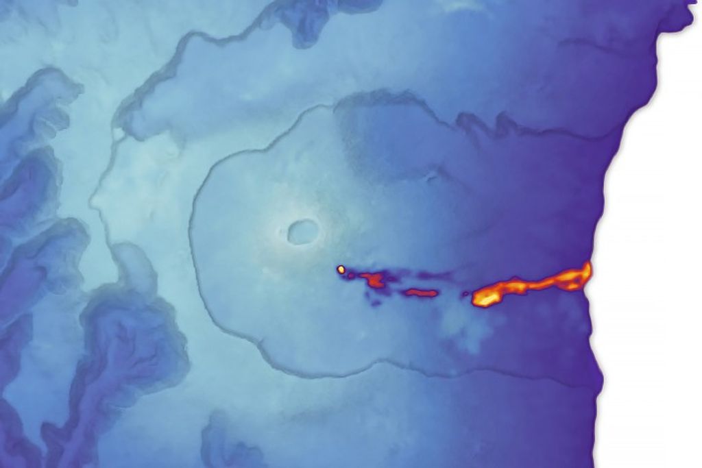
It’s a reasonably good map, with one big flaw: the colors are more appropriate for categorical data (such as a geological map of different rock types) rather than sequential data (like elapsed time). There’s no natural progression from one color to the next, so to work out the ordering one has to rely on the position of adjacent bands of color, or look repeatedly between the map and the key. A palette that varied from light to dark, dull to saturated, or both, would be easier to read at a glance. Like this:
![]()
Since I’m still not ready to do a long series of posts on colors, here’s a handout I wrote for the 2008 Access Data Workshop that covers more of the basics: Use of Color in Data Visualization. (PDF) If you’re really interested in the topic just skip what I wrote and go straight to the references:
- Brewer, Cynthia A. (2005) Designing Better Maps: A Guide for GIS Users. Redlands, CA: ESRI Press.
- MacEvoy, Bruce. (2008) Watercolors. Accessed April 28, 2008.
- Rogowitz, B.E.; Treinish, L.A. (1998) Data visualization: the end of the rainbow, Spectrum, IEEE , vol.35, no.12, pp.52-59.
- Tufte, Edward R. (1990) Envisioning Information. Cheshire, CT: Graphics Press.
- Ware, Colin. (2005) Information Visualization, Second Edition. San Francisco, CA: Morgan Kaufmann.
