


News Roundup: A Less Hardy Hardiness Map, Arctic Freshening, and More
A Less Hardy Hardiness Map

The USDA has unveiled a new version of its plant hardiness map, which gardeners use to gauge which plants will survive in which climate zone. (Check your nearest seed packet.) In the newest iteration, many zones have shifted northward because winters aren’t as cold as they were 22 years ago when the agency last updated the map — good news if you’re trying to grow, say, figs in Boston. On the new map, most parts of the United States are a half-zone warmer — about 5 degrees Fahrenheit (2.7 Celsius). Global warming surely underlies much of the change, but the USDA points out that more sophisticated mapping techniques, plus the inclusion of data from additional weather stations, has also affected the distribution of the zones.
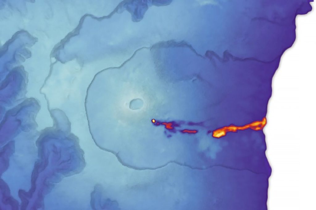
Why the Arctic Ocean Isn’t Freshening
Rapid freshening on the North American side of the Arctic Ocean in recent decades has prompted speculation that rapid melting of sea ice might be causing a slowing of the “conveyor belt” that keeps water circulating through the world’s oceans. New research led by scientists at the University of Washington helps allay such fears. The researchers conclude that freshwater from the Eurasian part of the Arctic Ocean, which comes originally from rivers in Russia, has simply found a new route that brings more of it toward Canada. The cause for the new freshwater route: changes in winds associated with a weather pattern known as the Arctic Oscillation. In fact, the analysis of satellite and oceanographic data shows that overall salinity in the Arctic Ocean remained constant between 2005 and 2008; as the Canadian portion became fresher, the Eurasian portion grew saltier. The shifting path of the fresh water is shown in red in the animation below.
Temperature Ranking-palooza
There’s always a flurry of media activity in January when scientists at NASA, NOAA, and the UK Met Office tally up the year’s temperature measurements and rank how warm the past year was. This January was no exception. In NASA’s analysis, 2011 came in as the 9th warmest year on the modern meteorological record. However, the longer-term trends are what really matter. Look at the whole record – and here are a few interactive charts that are useful for doing that – and it’s clear that the last decade has been the hottest on record. Another remarkable stat: 9 of the 10 hottest years have occurred since 2000. For more details, the science team that manages NASA’s analysis has published a thorough temperature update here.
Image Gallery: Top Climate and Weather Events of 2011
As part of an annual review of Earth’s climate, scientists from NOAA and other institutions have compiled lists of the ten most significant climate and weather events of the past year.In making their recommendations, judges considered the scope, how unusual the event was, and how much human and economic damage it caused. For the United States, the spring rash of tornadoes in the Southeast, extreme drought in the South, a tornado in Missouri, and spring flooding of the Ohio and Mississippi Rivers topped the list. For Earth as a whole, extreme drought in East Africa, flooding in Thailand and Eastern Australia, the persistence of La Nina, and Tropical Storm Washi all made the list.
A Climate Stopgap (That’s Good for Your Health)
Scanning the coverage of a study published recently in Science could leave you thinking scientists have come across a miracle cure for global warming, while simultaneously saving lives and boosting agricultural yields. The good news is that researchers have demonstrated how a set of simple control strategies for methane and black carbon – such as patching up gas pipelines or using existing technology to reduce vehicle emissions – could markedly slow the pace of climate change AND produce health and agricultural benefits. But the flip side is that such actions would provide only a short-term benefit. In the longer term, societies still have to tackle carbon dioxide emissions to get the climate back to a state of equilibrium.
Explore Ignite@AGU
http://www.youtube.com/watch?v=ExuzZrdW58c&feature=player_embedded
If you get a kick out of TED talks — those rapid-fire, information-packed lectures that have turned many little-known academics into YouTube stars — it’s time you also check out Ignite. Whereas TED talks can be up to 18 minutes, Ignite allows speakers just five minutes and a maximum of 20 slides. Above, watch NASA Goddard’s Richard Kleidman use his five minutes at an Ignite event to explain why the world needs a more robust network of ground sensors for monitoring air pollution.