





















Recently, we published a data visualization showing tropospheric NO2 over the Indian Ocean. The effort got us to thinking about how we try to present data in a way that’s easy to interpret while staying true to the science. The visualization below of satellite measurements of NO2 in the atmosphere revealed the location of shipping lanes in the […]
Tournament Earth: Only 8 Remain
How is your bracket looking now after Round 2 of Tournament Earth?
March Puzzler
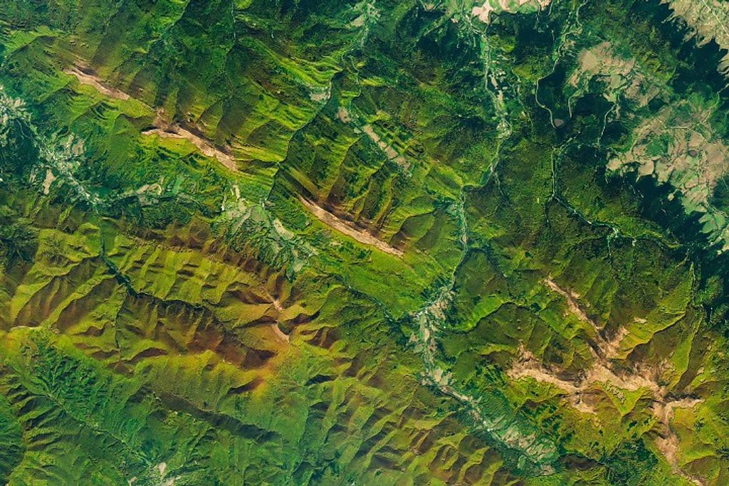
Use the comments section to tell us what part of the world we are looking at, when the image was acquired, and why the scene is interesting.
Is Animation an Effective Tool for Data Visualization?
The increasing use of animation (and 3D) in data and information visualization is definitely a trend, but I don’t think it’s a good one.
Australia’s Angry Summer
Australia is no stranger to fires, floods, drought, and heat. But a new report from the Australian Climate Commission not only points out that fire hazards and extreme weather events are worsening, it links them to a warming climate. The report focuses on what it calls the “Angry Summer” of 2012/2013. The 90-day period included […]