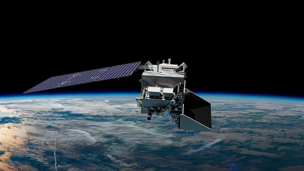


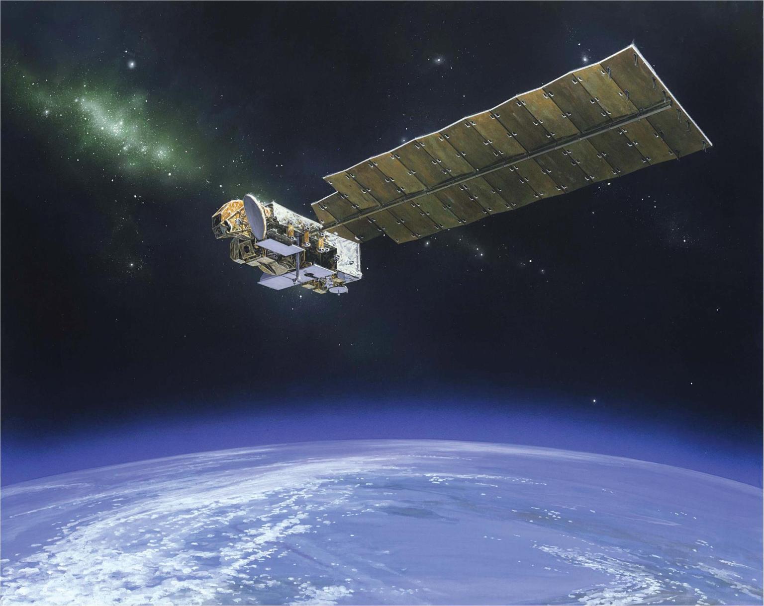
From monitoring the hole in the ozone above the Antarctic to studying air quality around the entire planet, NASA’s Aura satellite has provided scientists with essential measurements during its two decades in orbit.
“The Aura mission has been nothing short of transformative for scientific research and applied sciences,” said Bryan Duncan, project scientist for NASA’s Aura satellite mission. “The mission’s data have given scientists and applied scientists an unparalleled view of air pollution around the world.”
Aura has revealed the effects of industrialization, environmental regulations, wildfires, the COVID-19 pandemic, and many other aspects of the air we breathe. The satellite paved the way for recent missions to study the atmosphere and its inner workings, including PACE and TEMPO. As the Aura mission team celebrates its launch anniversary of July 15, 2004, here are a few of the many highlights from the last 20 years.
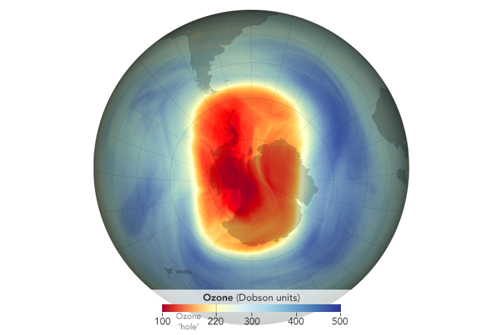
Aura Eyes Ozone Hole over Antarctica
The first publicly released image from the Aura mission (autumn 2004) showed dramatically depleted levels of ozone in the stratosphere over Antarctica.
NASA Study: First Direct Proof of Ozone Hole Recovery Due to Chemicals Ban
In a 2018 study, scientists showed for the first time through direct satellite observations that levels of chlorine in the atmosphere declined, resulting in less ozone depletion. Because of an international ban on chlorine-containing manmade chemicals called chlorofluorocarbons, there was about 20% less ozone depletion during the Antarctic winter in 2016 than there was in 2005.
New NASA Satellite Maps Show Human Fingerprint on Global Air Quality

Using high-resolution global maps of air quality indicators made with data from the Aura satellite, NASA scientists tracked air pollution trends between 2005 and 2015 in various regions and 195 cities around the globe. The study found that the United States, Europe, and Japan saw improved air quality due to emission control regulations, while China, India, and the Middle East, with their fast-growing economies and expanding industry, saw more air pollution.
How NASA is Helping the World Breathe More Easily
Many of NASA’s Earth-observing satellites, including Aura, can see what the human eye can’t — including potentially harmful pollutants lingering in the air we breathe. These satellites help us measure and track air pollution as it moves around the globe and have contributed significantly to a decades-long quest for cleaner air. For example, data from Aura’s Ozone Monitoring Instrument helped the EPA and NASA identify a drop in nitrogen dioxide that researchers cited as evidence of the success of the Clean Air Act.
Air Quality: A Tale of Three Cities
Air quality in Beijing, Los Angeles, and Atlanta — like air quality across the globe — is dynamic. This video describes how scientists use instruments like Aura’s Ozone Monitoring Instrument to study questions including what causes ozone, sulfur dioxide, and nitrogen dioxide emissions. It also explores why reductions in volatile organic carbon pollution worked to reduce ground-level ozone in Los Angeles, but not in Atlanta.
Seeing the COVID-19 Pandemic from Space
Economic and social shutdowns in response to the COVID-19 pandemic led to noticeable changes in Earth’s environment, at least in the short term. NASA researchers used satellite and ground-based observations – including nitrogen dioxide levels from Ozone Monitoring Instrument – to track these impacts on our air, land, water, and climate.
A Satellite’s View of Ship Pollution
With natural-color satellite imagery of the atmosphere over the ocean, scientists have observed “ship tracks” — bright, linear trails amidst the cloud layers that are created by particles and gases from ships. Scientists used Ozone Monitoring Instrument data to detect the almost invisible tracks of nitrogen dioxide along several shipping routes from 2005 to 2012.
First Global Maps of Volcanic Emissions Use NASA Satellite Data

With the Ozone Monitoring Instrument data, researchers compiled emissions data from 2005 to 2015 create the first global inventory for volcanic sulfur dioxide emissions. The data set helped refine climate and atmospheric chemistry models and provided more insight into human and environmental health risks.
Scientists Show Connection Between Gas Flaring and Arctic Pollution
Flaring of excess natural gas from industrial oil fields in the Northern Hemisphere was found to be a potentially significant source of nitrogen dioxide and black carbon emissions polluting the Arctic, according to a 2016 NASA study that included data from Aura.
2023 Ozone Hole Ranks 16th Largest, NASA and NOAA Researchers Find
Researchers continue to rely on Aura data to monitor the Antarctic ozone hole, two decades after the satellite launched. Each Southern Hemisphere spring, NASA and NOAA (National Oceanic and Atmospheric Administration) use satellite and balloon-based measurements to measure the maximum size of the ozone hole. The story above notes the 2023 result; stay tuned for what Aura helps us discover in 2024 and beyond.
By Erica McNamee and Kate Ramsayer
NASA’s Goddard Space Flight Center, Greenbelt, Md.