


Visualization: From Energy to Image
HOW DO WE VISUALIZE LIGHT WE CAN'T SEE?
False color, or representative color, is used to help scientists visualize data from wavelengths beyond the visible spectrum. Scientific instruments onboard NASA spacecraft sense regions within the electromagnetic spectrum—spectral bands. The instruments direct the electromagnetic energy onto a detector, where individual photons yield electrons related to the amount of incoming energy. The energy is now in the form of "data," which can be transmitted to Earth and processed into images.
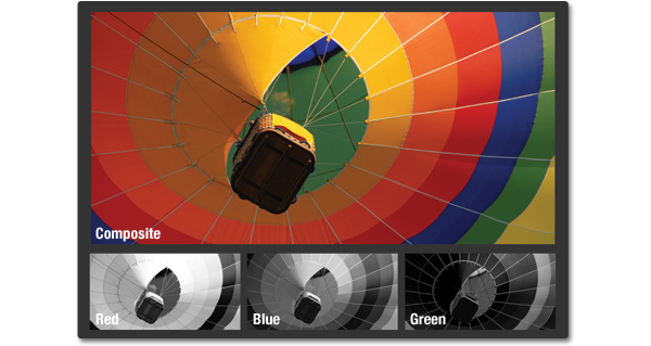
DIGITAL CAMERA
Digital cameras operate similarly to some scientific instruments. A sensor in the camera captures the brightness of red, green, and blue light and records these brightness values as numbers. The three sets of data are then combined in the red, green, and blue channels of a computer monitor to create a color image.
NATURAL COLOR IMAGES
Instruments onboard satellites can also capture visible light data to create natural color, or true color, satellite images. Data from visible light bands are composited in their respective red, green, and blue channels on screen. The image simulates a color image that our eyes would see from the vantage point of the spacecraft.

FALSE COLOR IMAGES
Sensors can also record brightness values in regions beyond visible light. This Hubble image of Saturn was taken at longer infrared wavelengths and composited in the red, green, and blue channels respectively. The resulting false-color composite image reveals compositional variations and patterns that would otherwise be invisible.


DATA FROM MULTIPLE SENSORS
This composite image of the spiral galaxy Messier 101 combines views from Spitzer, Hubble, and Chandra space telescopes. The red color shows Spitzer's view in infrared light. It highlights the heat emitted by dust lanes in the galaxy where stars can form. The yellow color is Hubble's view in visible light. Most of this light comes from stars, and they trace the same spiral structure as the dust lanes. The blue color shows Chandra's view in x-ray light. Sources of x-rays include million-degree gas, exploded stars, and material colliding around black holes.

Such composite images allow astronomers to compare how features are seen in multiple wavelengths. It's like "seeing" with a camera, night-vision goggles, and x-ray vision all at once.
COLOR MAPS
To help scientists visualize a data set of just one range of values, such as temperature or rainfall, the values are often mapped to a color scale from minimum to maximum. The “color map” below visualizes sea surface salinity data from the Aquarius satellite using a scale from blue to white. The blue end of the scale shows the lowest amounts of dissolved salts in the ocean and the white end shows the highest amounts.

A commonly used color scale has red at one end and blue at the other creating a “rainbow-like” scale. The sea surface temperature map below uses a scale from dark blue for cold temperatures to red for warm temperatures..

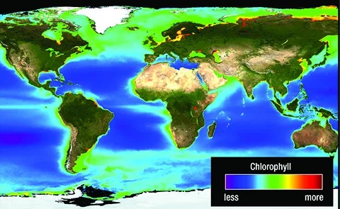
In some cases these colors do not represent traditional meaning—such as red referring to “bad” or “hot.” For example, red in the map below is good because it indicates high amounts of chlorophyll associated with an abundance of microscopic plants known as phytoplankton that support the ocean ecosystem.
Learn more with this activity about Color Mapping.
Citation
APA
National Aeronautics and Space Administration, Science Mission Directorate. (2010). Visualizations: From Energy to Image. Retrieved [insert date - e.g. August 10, 2016], from NASA Science website: http://science.nasa.gov/ems/04_energytoimage
MLA
Science Mission Directorate. "Visualizations: From Energy to Image" NASA Science. 2010. National Aeronautics and Space Administration. [insert date - e.g. 10 Aug. 2016] http://science.nasa.gov/ems/04_energytoimage