


Summer of Heat Waves Lesson Plan
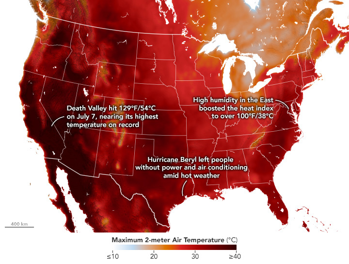
As summer heat hit the western and eastern U.S. in July 2024, temperatures have been especially high in the Southwest. View the full story
NASA Earth Observatory / Wanmei Liang
| Levels |
|
|---|---|
| Material Type |
|
| Heliophysics Topics |
|
| Related Missions |
|
| Material Cost per Learner | Free |
| Language | English |
In this lesson plan, students investigate historical heat wave frequency data to understand the importance of defining terms when interpreting data. Using extreme temperatures from July 2022 as a starting point, students explore three sections: Extreme Air Temperatures, Frequency of Heat Waves, and Counting Heat Wave Days. Each section provides information followed by guided questions to help students analyze data patterns and understand how scientific terminology affects data interpretation. This My NASA Data lesson emphasizes critical thinking skills in climate data analysis.
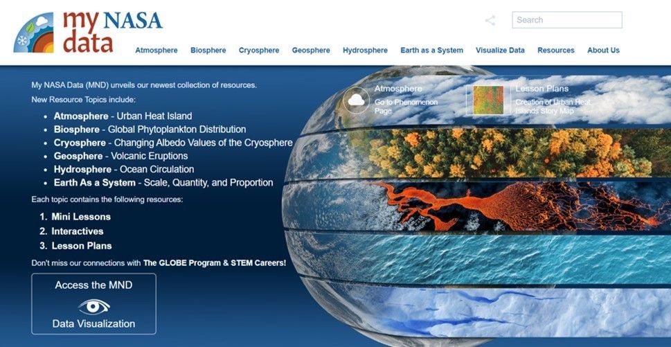
The landing page of the My NASA Data website.