


Downloads
Description

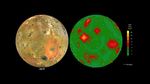
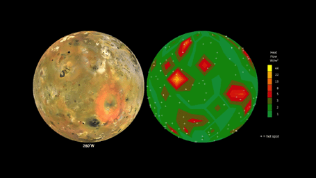
Click on the image for the full animation
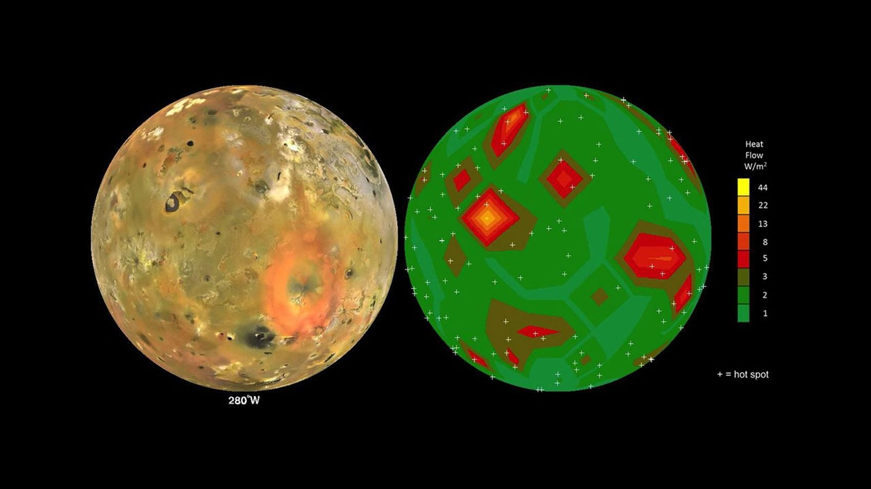
This animation shows Jupiter's volcanic moon Io as seen by NASA's Voyager and Galileo spacecraft (at left) and the pattern of heat flow from 242 active volcanoes (at right). The red and yellow areas are places where local heat flow is greatest -- the result of magma erupting from Io's molten interior onto the surface.
The map is the result of analyzing decades of observations from spacecraft and ground-based telescopes. It shows Io's usual volcanic thermal emission, excluding the occasional massive but transient "outburst" eruption; in other words, this is what Io looks like most of the time.
This heat flow map will be used to test models of interior heating. The map shows that areas of enhanced volcanic heat flow are not necessarily correlated with the number of volcanoes in a particular region and are poorly correlated with expected patterns of heat flow from current models of tidal heating -- something that is yet to be explained.
This research is published in association with a 2015 paper in the journal Icarus by A. Davies et al., titled "Map of Io's Volcanic Heat Flow," (http://dx.doi.org/10.1016/j.icarus.2015.08.003.)
The work was funded by NASA's Outer Planets Research and Planetary Geology and Geophysics Programs. The Jet Propulsion Laboratory, Pasadena, California, is managed for NASA by the California Institute of Technology.