


![Request for Information – Potential [Placeholder for Prize]](https://assets.science.nasa.gov/dynamicimage/assets/science/psd/solar/2023/09/s/solarsystem_0.jpg?w=1024)


Introduction (Subtleties of Color, Part 1 of 6)
The use of color to display data is a solved problem, right? Just pick a palette from a drop-down menu (probably either a grayscale ramp or a rainbow), set start and end points, press “apply,” and you’re done. Although we all know it’s not that simple, that’s often how colors are chosen in the real world. As a result, many visualizations fail to represent the underlying data as well as they could.
The purpose of data visualization—any data visualization—is to illuminate data. To show patterns and relationships that are otherwise hidden in an impenetrable mass of numbers.
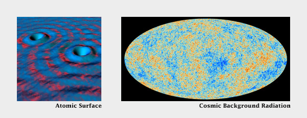
In spatial datasets [datasets with at least two dimensions specifying position, and at least one additional dimension of quantity (a category that includes not only maps, but everything else ranging from individual atoms to cosmic background radiation)] color is probably the most effective means of accurately conveying quantity, and certainly the most widespread. Careful use of color enhances clarity, aids storytelling, and draws a viewer into your dataset. Poor use of color can obscure data, or even mislead.
Fortunately, the principles behind the effective use of color to represent data are straightforward. They were developed over the course of more than a century of work by cartographers, and refined by researchers in perception, design, and visualization from the 1960s on.
Although the basics are straightforward, a number of issue complicate color choices in visualization. Among them:
- The relationship between the light we see and the colors we perceive is extremely complicated.
- There are multiple types of data, each suited to a different color scheme.
- A significant number of people (mostly men), are color blind.
- Arbitrary color choices can be confusing for viewers unfamiliar with a data set.
- Light colors on a dark field are perceived differently than dark colors on a bright field, which can complicate some visualization tasks, such as target detection.
(Very) Basic Color Theory
Although our eyes see color through retinal cells that detect red, green, and blue light, we don’t think in RGB. Rather, we think about color in terms of lightness (black to white), hue (red, orange, yellow, green, blue, indigo, violet), and saturation (dull to brilliant). These three variables (originally defined by Albert H. Munsell) are the foundation of any color system based on human perception. Printers and painters use other color systems to describe the mixing of ink and pigment.

Computers (and computer programmers) on the other hand, do process colors in terms of red, green, and blue. Just not the same red, green, and blue that our eyes detect. Computer screens display colors that are a combination of very narrow frequency bands, while each type of cone in our eyes detect a relatively broad spectrum. Complicating things further, computers calculate light linearly, while humans perceive exponentially (we are more sensitive to changes at low light levels than high light levels), and we’re more sensitive to green light than red light, and even less sensitive to blue light.
The combined result of these nonlinearities in our vision is color perception that’s, well, lumpy. For example, the range of saturation we’re capable of seeing for a single hue is highly dependent on its lightness. In other words, there’s no such thing as a dark yellow. Near the center of the lightness range, blue and red shades can be very saturated, but green tones cannot. Very light and very dark colors are always dull.

CIE Color Spaces
The unevenness of color perception was mapped by the International Commission on Illumination (Commission Internationale de l´Eclairage in French, hence “CIE”) in the 1930s. The CIE specified (and continues to refine) a series of color spaces that allow scientists, artists, and printers—anyone who works with light—to describe colors consistently, and accurately translate color between mediums. CIE L*a*b, for example, is used internally by Adobe Photoshop to interpolate color gradients and convert images from RGB (screen) to CMYK (print).
Another of these specifications: CIE L*C*h [lightness, chroma (saturation), hue] is my preferred tool for crafting color palettes for use in visualization. Because the three components of CIE L*C*h are straightforward, it’s simple to use. Because it’s based on studies of perception, color scales developed with L*C*h help accurately represent the underlying data. I say “help” because perfect accuracy is impossible—there are too many variables in play between the data and our brains. [Another option (used in Color Brewer) is the Munsell Color System, which is accurate in lightness and hue, but not in saturation.]

In short, people aren’t computers. Computer colors are linear and symmetrical, human color perception is non-linear and uneven. Yet many of the tools commonly used to create color schemes are designed more for computers than people. These include tools that calculate or specify colors in the red, green, blue (RGB) or hue, saturation, value (HSV) color spaces. A constant increase in brightness is not perceived as linear, and this response is different for red, green, and blue. Look for tools and color palettes that describe colors in a perceptual color space, like CIE L*C*h or Munsell.
In the rest of this series, I’ll outline the principles behind the “perfect” color palette, describe different types of data that require unique types of palettes, give some suggestions for mitigating color blindness, and illustrate some tricks enabled by careful use of colors.
Subtleties of Color Series
Part 1: Introduction
Part 2: The “Perfect” Palette
Part 3: Different Data, Different Colors
Part 4: Connecting Color to Meaning
Part 5: Tools & Techniques
Part 6: References & Resources for Visualization Professionals
Earth Observatory
NASA's Earth Observatory brings you the Earth, every day – the images, stories, and discoveries about the environment, Earth systems, and climate that emerge from NASA research.
Learn More