


The “Perfect” Palette (Subtleties of Color, Part 2 of 6)
The “Perfect” Palette
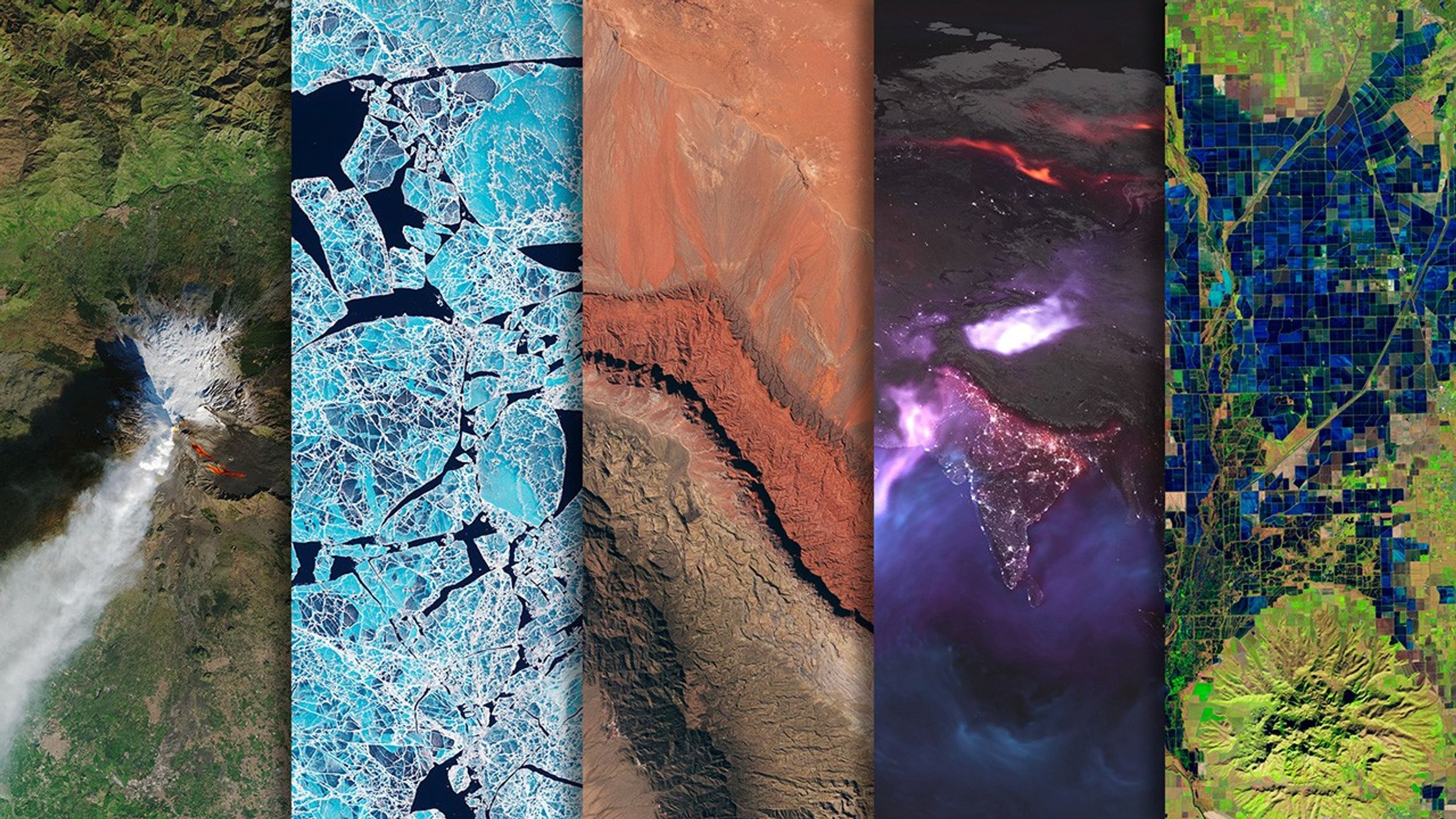
Despite the near-ubiquity of the rainbow palette—which distorts patterns in the underlying data—the basics of using color to represent numerical data are well-established.
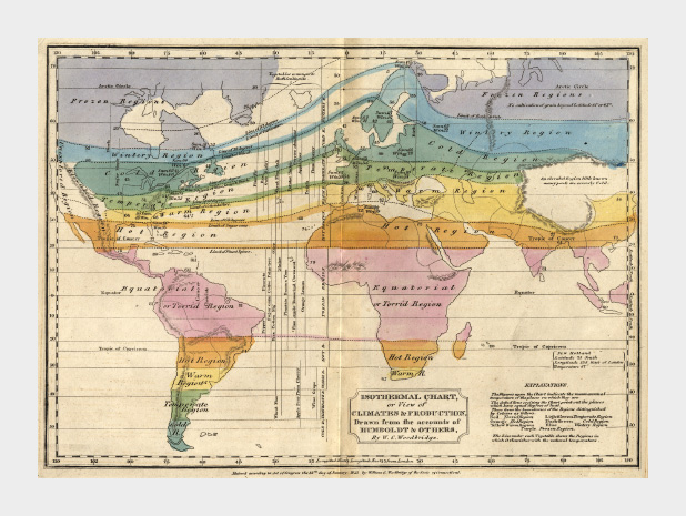
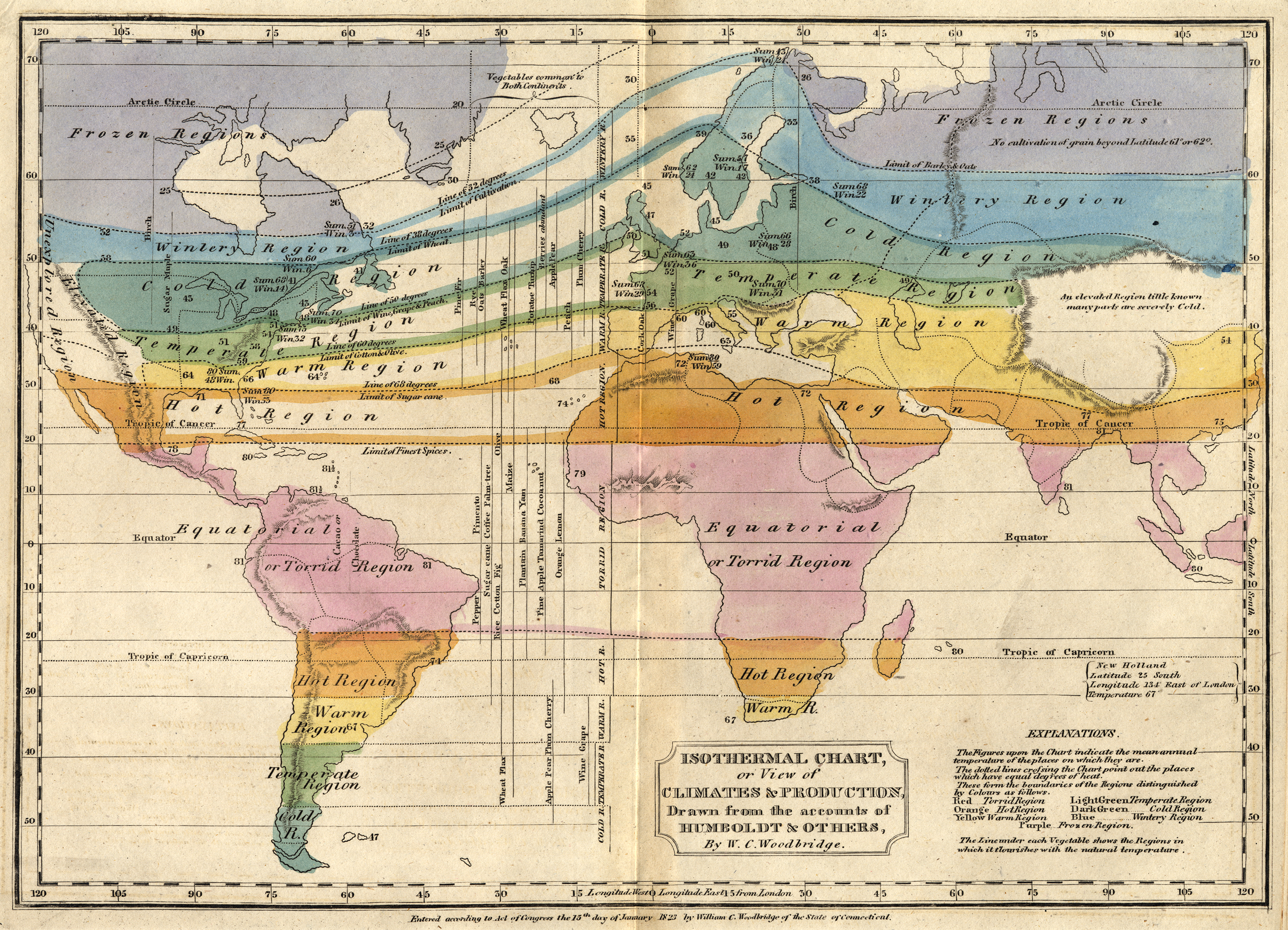
By the mid-1960s cartographers had already established guidelines for the appropriate use of color in map-making. Jacques Bertin pointed out shortcomings of the rainbow palette in Sémiologie Graphique (The Semiology of Graphics), and Eduard Imhof was crafting harmonious color gradients for use in topographic maps [published in Kartographische Geländedarsellung (Cartographic Relief Presentation)].
In the 1980s and 1990s researchers in perception and visualization were investigating the efficacy of palettes, based on the ways our brains and eyes physically respond to light. These color scales were crafted to achieve the principal goals of spatial displays: to show patterns and relationships in data, and to allow a viewer to accurately read individual values. [Colin Ware (1988) Color Sequences for Univariate Maps: Theory, Experiments, and Principles; Brewer (1994) Color Use Guidelines for Mapping and Visualization; Rogowitz and Treinish (1995) How NOT to Lie with Visualization; Tufte (1997) Visual Explanations; Spence et al. (1999) Using Color to Code Quantity in Spatial Displays.]
According to much of this research, a color scale should vary consistently across the entire range of values, so that each step is equivalent, regardless of its position on the scale. In other words, the difference between 1 and 2 should be perceived the same as the difference between 11 and 12, or 101 and 102, preserving patterns and relationships in the data. (For data with a wide range that is better displayed logarithmically, relative proportions should be maintained: the perceived difference between 1 and 10 should be the same as 1,000 and 10,000.) Consistent relationships between numbers—like in a grayscale palette—preserves the form of the data. Palettes with abrupt or uneven shifts can exaggerate contrast in some areas, and hide it others.

A palette should also minimize errors from the color shifts introduced by nearby areas of differing color or lightness, a phenomenon known as simultaneous contrast.

Simultaneous contrast is most pronounced in monochromatic palettes, while sharp variations in hue minimize the effect. As a result variations of the rainbow palette are good for preserving exact quantities.
How to take advantage of the strengths of both the grayscale palette (preservation of form) and rainbow palette (preservation of quantity), while minimizing their weaknesses? Combine a linear, proportional change in lightness with a simultaneous change in hue and saturation. Colin Ware describes this type of palette as “a kind of spiral in color space that cycles through a variety of hues while continuously increasing in lightness” (Information Visualization: Perception for Design, Second Edition). The continuous, smooth increase in lightness preserves patterns, the shift in hue aids reading of exact quantities, and the change in saturation enhances contrast.

Of the three components of color—hue, saturation, and lightness—lightness is the strongest. As a result, accurate, one-way changes in lightness are more important than those in hue or saturation. For example, a color scale that goes from black to color to white can still be read accurately, even though the saturation is lower at both ends of the scale than in the middle. This allows a bit of flexibility in designing palettes, especially for datasets that benefit from high-contrast color ramps. You also don’t need to worry too much about color scales that drift a little bit out of gamut (the complete range of colors displayed on a particular device) for a portion of the ramp. Just make sure lightness is still changing smoothly.

All of these palettes are appropriate for sequential data. Data that varies continuously from a high to low value; such as temperature, elevation, or income. Different palettes are suited to other types of data, such as divergent and qualitative, which I’ll discuss next week.
Subtleties of Color Series
Part 1: Introduction
Part 2: The “Perfect” Palette
Part 3: Different Data, Different Colors
Part 4: Connecting Color to Meaning
Part 5: Tools & Techniques
Part 6: References & Resources for Visualization Professionals
Earth Observatory
NASA's Earth Observatory brings you the Earth, every day – the images, stories, and discoveries about the environment, Earth systems, and climate that emerge from NASA research.
Learn More