This is How Scientists Measure Global Temperature
The global temperature record of the past century shows that Earth is warming at an unprecedented rate. 2024 was the hottest year on record, and the past 10 years have been the warmest in recorded history. Each of the last four decades has been warmer than any decade that preceded it, dating back to 1850.
This global warming has been caused by human activities, primarily the emission of heat-trapping greenhouse gases, according to the 2023 synthesis report of the Intergovernmental Panel on Climate Change. And we’re seeing the impacts in heat waves, wildfires, intense rainfall, and coastal flooding.
For nearly 45 years, a team of scientists at NASA’s GISS has been tracking these rising temperatures and producing records and analyses of the global temperature of Earth. Each month, scientists release a dataset.
The process for producing NASA’s temperature record is rigorous and complex. Here’s a look at how — and why — it is done.
Scientists Collect Data from Across the Planet’s Land and Ocean
Science institutions measure local temperature in many ways. On land, thermometers affixed to tens of thousands of weather stations give us precise air temperature readings. Ships and buoys floating in the ocean capture temperatures at the sea surface. These individual measurements tell us the temperature at any one place for that day and time.
Calculating an average global temperature requires collecting all those datasets — from the land and ocean surface — and then applying a special mathematical method to the numbers.
Climate scientists focus on how temperature has changed over time. For each individual station, they calculate how the temperature has strayed from an original baseline; these are known as anomalies. The baseline used is the temperature average from the 30-year period 1951—1980. Every location is measured against that 20th century average.
Global Temperature is Measured with Anomalies
Think of it this way. A temperature reading taken on a mountaintop will be cooler than one taken in a nearby valley, just as the temperature under the shade of a tree will be cooler than a reading taken in a sunlight-drenched parking lot just feet away. Temperature can vary significantly over relatively short distances.
But the temperature change between two nearby locations is remarkably consistent. For example, when it’s 2 degrees warmer than normal in Denver, it’s going to be 2 degrees warmer than normal at the top of Bear Peak, a mountaintop 40 miles away.
That the average temperature change over time is similar in Baltimore and Philadelphia or in Austin and Fort Worth can be attributed to long, consistent weather patterns, meaning the temperature anomalies of weather stations within an 800-mile distance are highly correlated. This is because large-scale weather systems can stretch to this distance. These correlations were first demonstrated in a 1987 paper published in the Journal of Geophysical Review by James Hansen and Sergei Lebedeff.
Is it as Simple as Averaging All the Anomalies Together?
No. For one thing, scientists must account for the varied spacing of temperature stations. There are fewer weather stations in the Sahara Desert and Antarctica, for example, than in other parts of the world.
Because temperature anomalies stay consistent across distances, scientists can fill gaps by making estimates for the areas surrounding individual weather stations. These estimates are weighted within the analysis: the closer a point on a map is to a station, the more accurate it is judged to be. Ultimately, this allows researchers to get coverage of nearly Earth’s entire surface.
Correcting for ‘Urban Heat Islands’
Scientists at NASA GISS also correct for hotter than normal temperatures that could skew the results. For example, the asphalt and concrete of major roads, uncovered parking lots, and buildings absorb more heat than green spaces. As a result, temperatures in cities are typically higher than those in rural areas. Plus, additional heat is generated from a city’s cars, trucks, factories, and air conditioning units.
Research shows that the impact of these urban heat islands has a miniscule effect on global temperature — about 100th of a degree, Lenssen said. Picture the size of a city compared to the size of the Pacific Ocean. Even the biggest cities aren’t big enough to make a difference on a global scale.
Still, to ensure that these urban data don't make the average artificially high, scientists remove temperature measurements captured in cities or at airports before they calculate averages.
Temperature Records Agree
NASA is one of several institutions that measure and track global temperature, along with Europe’s Copernicus Climate Change Center, the U.S. National Oceanic and Atmospheric Administration, Berkeley Earth, and the UK’s Met Office.
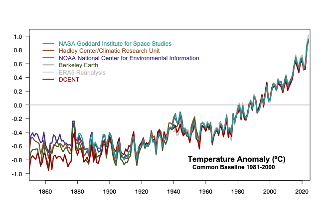
The various organizations use different methods to calculate global temperature and address uncertainties. Still, the resulting estimates are in close agreement. And they also match up closely to independent datasets derived from satellites and weather forecast models.
Take a look at this graph below, which shows global temperature records from the mid-1850s through 2023. (NASA’s global temperature record starts in 1880 because observations based on current methods did not sufficiently cover enough of the planet prior to that time.) You can see how closely the records compare and how they’ve become even more aligned over time.
The records are supported by evidence contained in natural materials. Tree rings grow wider in warmer, wetter years. Ice cores — chunks of ice drilled from ice sheets or glaciers — also hold clues to past temperatures. Combine that with natural evidence from coral, pollen, and cave records, and scientists can piece together records of our planet’s climate dating back millions of years.
Temperature records agree, and natural evidence backs it up: Global surface temperature has increased faster since 1970 than in any other 50-year period over at least the past 2,000 years.
El Niño and La Niña Don’t Impact the Long-Term Trend
The temperature in any individual year can be influenced by El Niño and La Niña, climate patterns that alternately warm and cool the tropical Pacific Ocean and can have far-reaching effects on weather around the world. This warming and cooling occurs cyclically in response to change in the strength of the trade winds; then, as the ocean changes, it alters rainfall patterns. This can result in severe droughts and intense rain in different parts of the world.
Scientists study other factors that might influence global temperature, including large volcanic eruptions and reductions in shipping pollution resulting from regulations on emissions. Changes in the amount of small ash or pollution particles in the air — aerosols — can change how much solar energy gets reflected back into space, slightly cooling or warming the planet.
While volcanoes and the El Niño Southern Oscillation, or ENSO, may contribute to variability from year to year — the peaks and valleys in the line graph above — they don’t alter the overall trend in temperatures.
Recent evidence suggests that the overall reduction in aerosol pollution, on the other hand, is playing a small role in long-term warming. For more than a century, aerosols released by the burning of fossil fuels have had a cooling effect on the climate by blocking solar radiation. Scientists estimate that this has made the planet about 0.7° F (0.4 °C) cooler than it otherwise would be, according to the 2021 report by the Intergovernmental Panel on Climate Change.
A gradual shift toward cleaner power plants, motor vehicles, and other technologies has reduced harmful particulate matter in the atmosphere, which has improved air quality in ways that help human health—but it’s likely making the planet temporarily a little warmer as a result. For instance, a 2020 international rule that sharply reduced the amount of sulfur dioxide in shipping fuel will likely also lead to some atmospheric warming, but the magnitude is small and further study is needed.
According to NASA's global temperature analysis, known as GISTEMP, the global temperature for 2024 was 1.28 degrees Celsius (2.30 degrees Fahrenheit) above the agency’s 20th-century baseline (1951—1980.) But NASA records show it was 1.47 degrees Celsius (2.65 degrees Fahrenheit) above pre-industrial levels (1850—1900.) Global average temperatures were at least 1.5 degrees above this pre-industrial average for five months in 2024 and four months in 2023.
Why We Should Care About 1 to 2 Degrees of Global Warming
Why should we care about one or two degrees of warming? After all, temperatures fluctuate by many degrees every day where we live.
The temperatures we experience locally and in short periods can fluctuate significantly due to predictable, cyclical events, such as the rising and setting of the Sun and the change of the seasons, along with hard-to-predict wind and precipitation patterns.
But the global temperature mainly depends on how much energy the planet receives from the Sun and how much it radiates back into space. The energy coming from the Sun fluctuates very little by year, while the amount of energy radiated by Earth is closely tied to the chemical composition of the atmosphere — particularly the amount of heat-trapping greenhouse gases.
A one-degree global change is significant because it takes a vast amount of heat to warm all of the oceans, the atmosphere, and the land masses by that much. In the past, a one degree global drop was all it took to plunge North America and Northern Europe into the Little Ice Age. A five-degree drop was enough to bury a large part of North America under a towering mass of ice 20,000 years ago.
How NASA’s Temperature Record Began
The origins of the NASA GISS temperature record can be traced back a half century and a million miles away to a study of planet Venus, a blistering planet that is kept hot by a thick atmosphere composed mostly of carbon dioxide. NASA climate scientist James Hansen was researching the atmosphere on Venus and had designed an instrument to be carried there — it snapped this image of the planet in the 1970s. But what he learned about Venus inspired him soon after to turn his attention to planet Earth where, like Venus, greenhouse gases were building up in the atmosphere.
The institute published its first global temperature record in 1981, the same year that Hansen became the director of NASA GISS, a position he held until 2013. This coincided with an article Hansen published in Science Magazine that concluded that a warming of 0.4 degrees Celsius in the 20th century was driven by rising levels of carbon dioxide.
In that article, Hansen also predicted that the planet would warm in the 1980s and that by the turn of the century, a signal of global warming would begin to emerge from the noise of natural variability. He wrote that the 21st century would see more drought, melting ice sheets, rising sea levels, and the opening of the Northwest Passage.
Refining the Method
The basic method of calculating global temperature, devised by Hansen and programmed by his colleague Sergej Lebedeff, was first described in that article. Over the years, the method has been refined. When Lebedeff died unexpectedly in 1990, Reto Ruedy took over the project and has since led the technical parts of the NASA GISS temperature analysis.
Over the years, Ruedy’s team has added new data sources, quality controls, and adjustments to account for urban heat. Sea surface anomalies were added to land-only measurements in 1995, improving the estimates. In the late 1990s, the analysis was made public online, along with interactive web pages.
The global temperature analysis is just a small part of the work done at GISS, where scientists also use climate models to assess atmospheric changes on Earth and on other planets and exoplanets. But the temperature analysis gets the most attention, as annual and monthly records continue to be broken.
Information in this piece came from the resources below and interviews with the following sources: Gavin Schmidt, Reto Ruedy, Nathan Lenssen, Peter Jacobs.
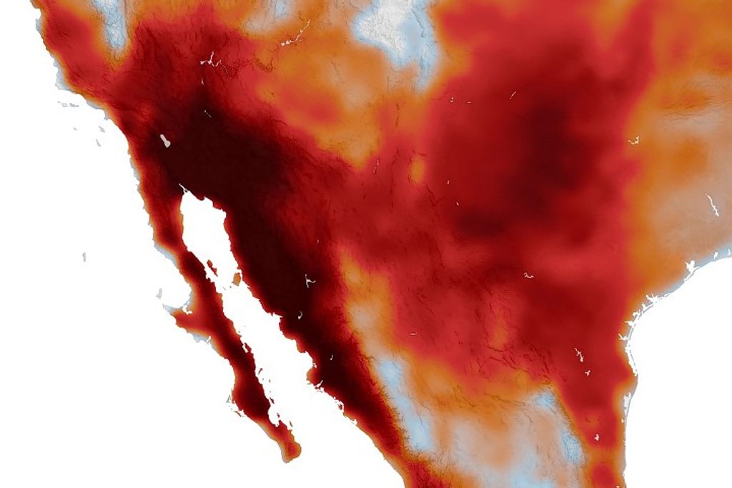
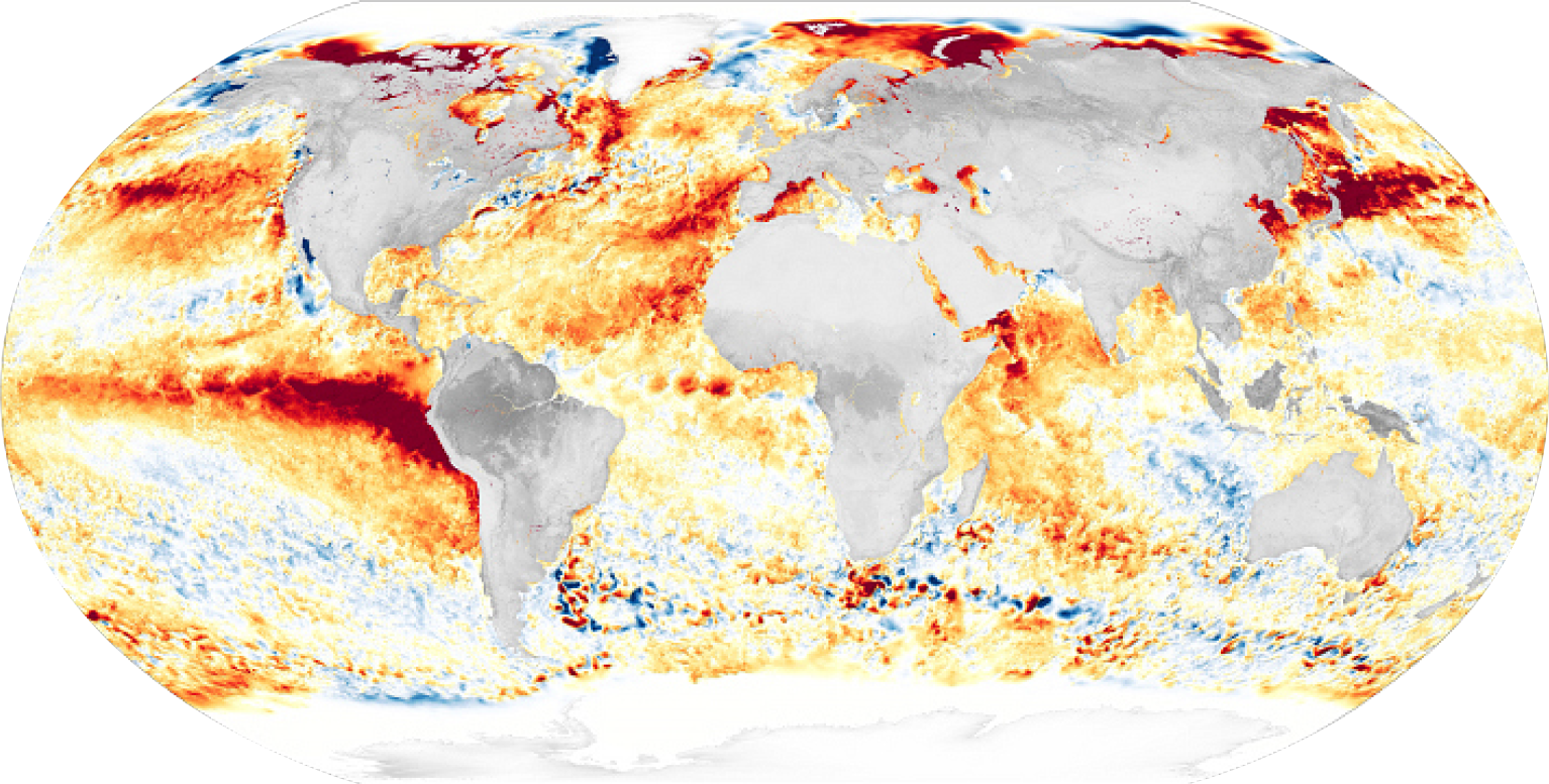
Caption for banner image: This map of Earth in 2024 shows global surface temperature anomalies, or how much warmer or cooler each region of the planet was compared to the average from 1951 to 1980. Normal temperatures are shown in white, higher-than-normal temperatures in red and orange, and lower-than-normal temperatures in blue. An animated version of this map shows global temperature anomalies changing over time, dating back to 1880. Download this visualization from NASA Goddard’s Scientific Visualization Studio: https://svs.gsfc.nasa.gov/5450. Credit: NASA Goddard's Scientific Visualization Studio.
Download this visualization from NASA Goddard’s Scientific Visualization Studio: https://svs.gsfc.nasa.gov/5450. Credit: NASA Goddard's Scientific Visualization Studio.
References and Sources
“AR6 Synthesis Report: Climate Change 2023” Intergovernmental Panel on Climate Change. March 20, 2023.
Carlowicz, Michael. (2023) “World of Change: Global Temperatures.” Earth Observatory.
“Data Buoy Types” Data Buoy Cooperation Panel.
“GISS Surface Temperature Analysis (GISTEMP): Frequently Asked Questions.” NASA Goddard Institute for Space Studies. Last updated: Dec 1, 2023.
“GISTEMP Surface Temperature Analysis” NASA Goddard Institute for Space Studies. Last updated November 26, 2024.
Hansen, J.E., et al. “Climate Impact of Increasing Atmospheric Carbon Dioxide.” Science Magazine. Vol 213, Issue 4511, pp. 957-966. August 28, 1981.
Hansen, James, “Why I Must Speak Out About Climate Change.” TedTalks. March 2012.
Hansen, J.E., and S. Lebedeff, “Global Trends of Measured Surface Air Temperature.” Journal of Geophysical Research, Vol 92, Pages 13345-13372, November 20, 1987.
“Introduction to Synoptic Meteorology” National Oceanic and Atmospheric Administration. Last updated May 16, 2023.
Miller, Kenneth G. et al., Ancient Sea Level as Key to the Future, Oceanography, Volume 33, No. 2. Pages 32 - 41.
Schmidt, Gavin. “We Study Climate Change. We Can’t Explain Anything.” The New York Times. Nov. 13, 2024.
“Paris Climate Agreement,” United Nations. December 12, 2015.
Younger, Sally. “NASA Analysis Confirms a Year of Monthly Temperature Records.” NASA.gov. June 11. 2024.


