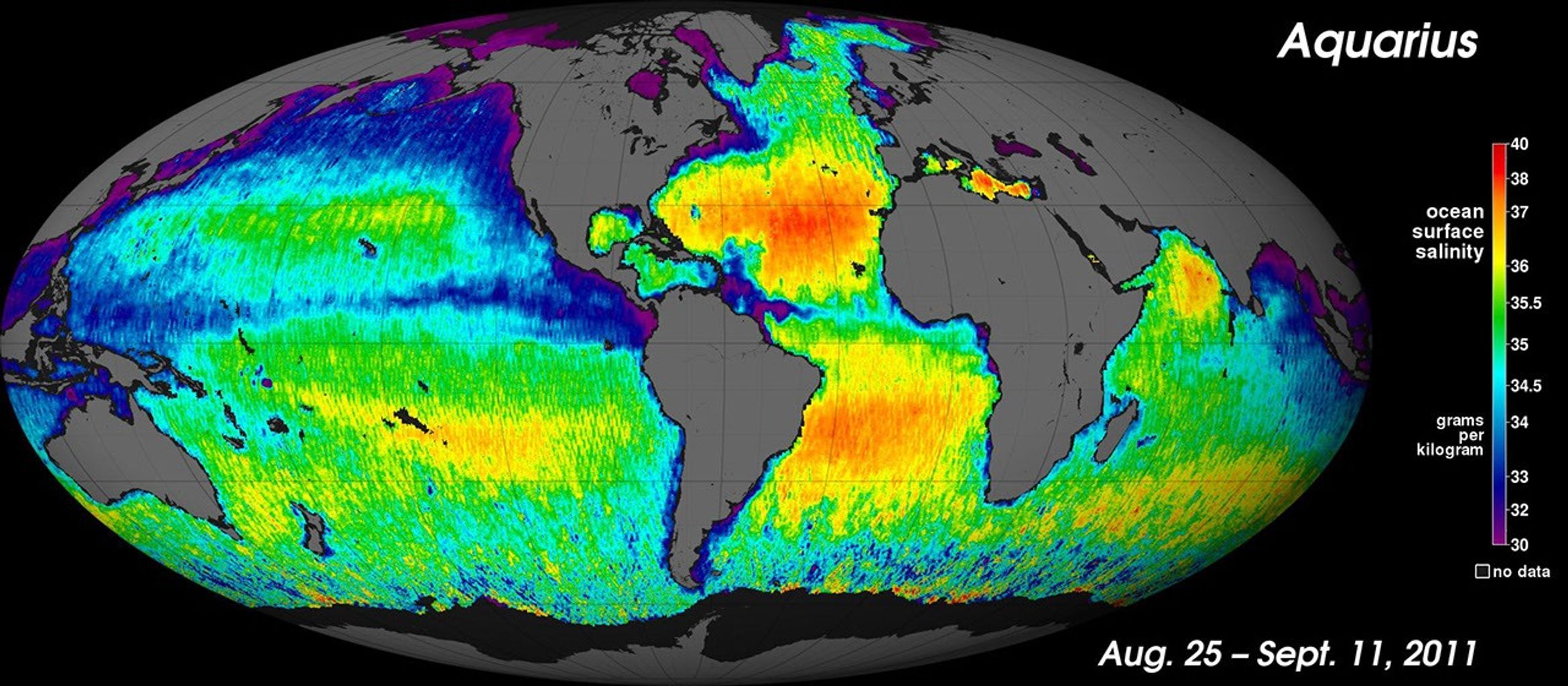


NASA’s “Salt of the Earth” Aquarius Reveals First Map

| Credit | NASA/GSFC/JPL-Caltech |
|---|---|
| PIA Number | PIA14786 |
| Language |
|
NASA's new Aquarius instrument has produced its first global map of the salinity, or saltiness, of Earth's ocean surface, providing an early glimpse of the mission's anticipated discoveries. Its rich tapestry of global salinity patterns demonstrates Aquarius' ability to resolve large-scale salinity distribution features clearly and with sharp contrast. The map provides a much better picture of ocean surface salinity than the Aquarius science team expected to have this early in the mission.
The new map is a composite of the first two and a half weeks of data since Aquarius became operational on August 25. The numerical values represent salt concentration in parts per thousand (grams of salt per kilogram of sea water). Yellow and red colors represent areas of higher salinity, with blues and purples indicating areas of lower salinity. Areas colored black are gaps in the data. The average salinity on the map is about 35.