2023 Annular Eclipse Poster – Kristen Perrin
| Credit | NASA/Kristen Perrin |
|---|---|
| Language |
|
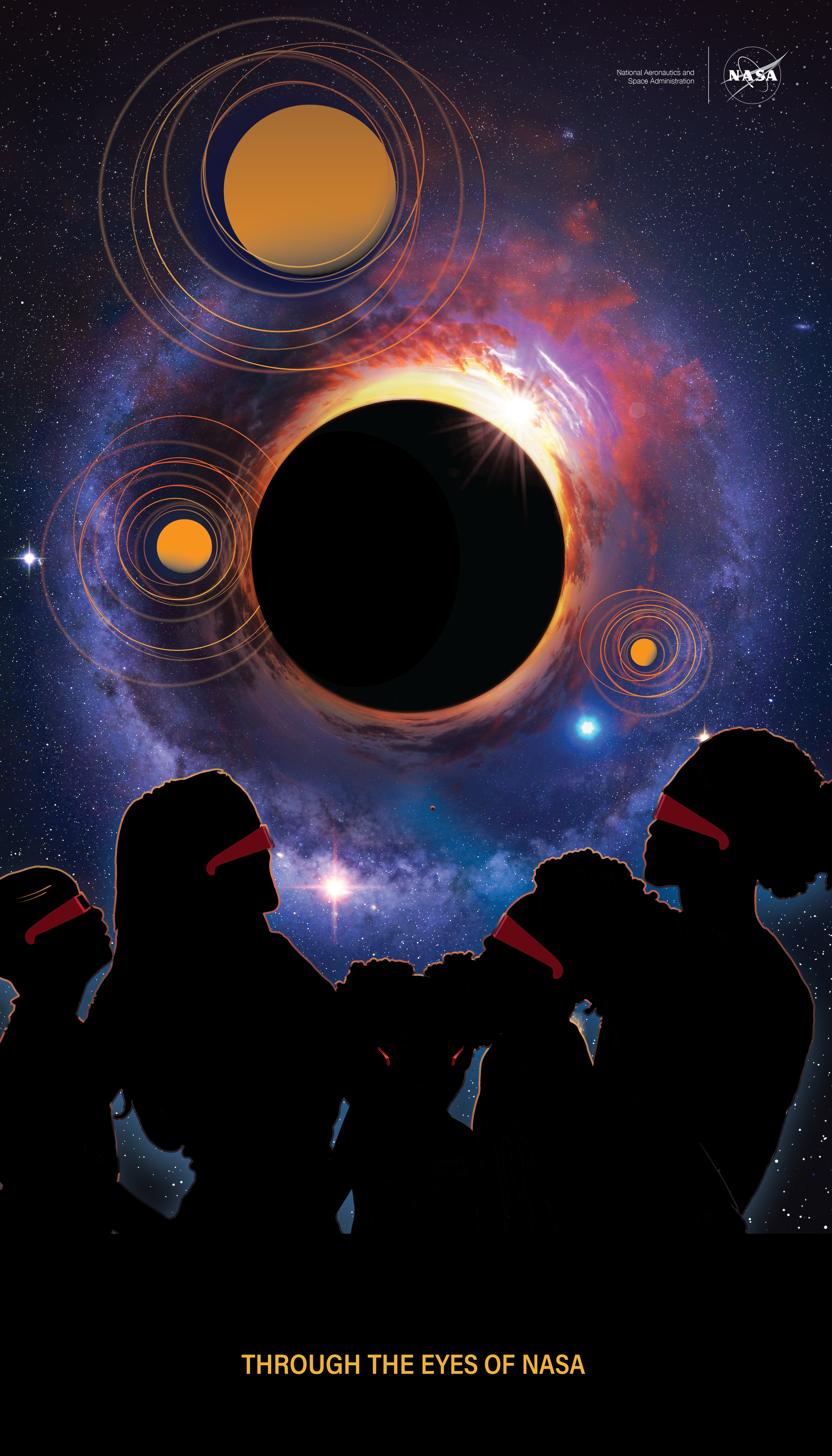
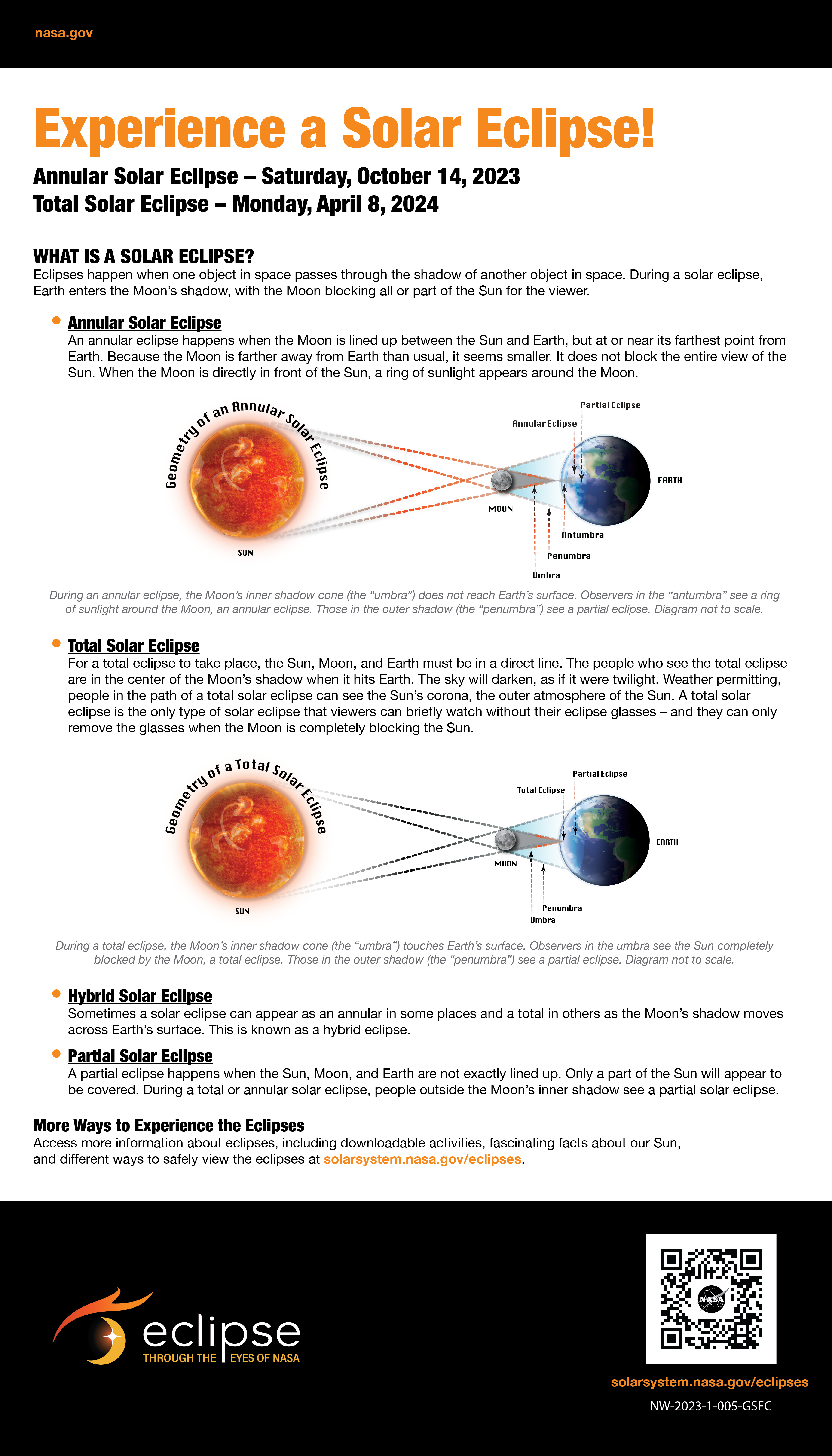
To celebrate the special role of eclipses in connecting art and science, creatives across NASA will be sharing their eclipse-inspired artwork in anticipation of two solar eclipses that will cross the United States on October 14, 2023, and April 8, 2024. This poster was created by Kristen Perrin.
Kristen Perrin is a successful African American woman, mother of four, and Senior Multimedia and Graphic Specialist. She graduated from Villa Julie College (now known as Steven University) with a Bachelor of Science degree in Visual Communication, with coursework and certificates from the Johns Hopkins Computer Institute for web development. Kristen has designed digital and physical products with several Fortune 500 companies, the United States Department of Defense, and the National Aeronautics and Space Administration.
“I felt as though the 2023 annular eclipse should be familiar, inspiring, and welcoming to all demographics, depicting the spectacular dynamics of the event being enjoyed by all. The three circles with multiple rings around them add a solar and planetary figurative dimension to the piece. The circles evoke the Moon, Sun, and planets in our solar system, while the rings in turn represent orbital paths as well as the ’ring’ created during the annular eclipse.
Oftentimes there is not enough cultural representation when solar or celestial events take place. Monumental events such as these are not discussed outright in urban communities — but that does not devalue the occurrence. I felt it was important to choose persons that represent a more modern and diverse audience to provide visual inclusion within the design of the poster. This event impacts the world in which we live in and should be shared and enjoyed by all.”

