


![Request for Information – Potential [Placeholder for Prize]](https://assets.science.nasa.gov/dynamicimage/assets/science/missions/a-step/FFR_Earth_Background_20251120%20.png?w=1024)


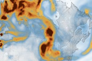
According to the U.S. Energy Information Administration’s statistics, U.S. carbon dioxide emissions totaled nearly six billion metric tons in 2007. Scientists and policymakers have long known about high carbon dioxide emissions from the United States as a whole, but finer spatial details of when and where carbon dioxide is emitted haven’t been available on a national level. Aimed at providing such information to advance carbon cycle science and policy, the Vulcan Project—named after the Roman god of fire—assessed carbon footprints across the United States.
Based on Vulcan Project data, this map shows annual carbon emissions, measured in kilotons, for the continental United States in 2002. The highest amounts appear deep red, and lowest amounts appear in pale yellow. Not surprisingly, emissions center around urban areas. The heaviest concentrations appear along the heavily populated East Coast, but other urban centers also show high emissions, including Saint Paul, Dallas-Fort Worth, Denver, Salt Lake City, San Francisco, and Los Angeles.
The Vulcan Project took a new approach to measuring carbon dioxide emissions by region. Previously, researchers had substituted population density as a proxy for emissions, but while this approach accurately correlated high populations and high emissions, it could miss other factors, such as a busy interstate highway passing through a sparsely populated area. To develop more accurate estimates, the Vulcan Project used a variety of statistics from the Environmental Protection Agency, the Federal Highway Administration, and the Census Bureau. The project also examined county records on building sizes, road extents, and registered vehicles. Feeding this information into computer models produced a map of carbon dioxide emissions.
One of the more interesting findings from this study was that different areas can produce high emissions for different reasons. The three highest-emitting counties in the United States include Harris, Texas; Los Angeles, California; and Cook, Illinois. High population density is common to all three counties, yet their primary sources for high emissions diverged. In Harris County, which includes Houston, the primary source was industrial emissions; in Los Angeles, it was automobiles; and in Cook County, which includes Chicago, it was combined commercial and residential electricity use.
The animation (6.4 MB QuickTime) shows hourly emissions for January 2002. The most visible pattern is the daily cycle of energy use. Emissions first rise during the early morning on the East Coast as people and businesses begin the day. As the sun moves west, emissions rise in its wake. In late afternoon and evening emissions taper off towards late-night minimums.
The Earth Observatory’s feature article American Carbon has additional information about the Vulcan Project study and United States carbon dioxide emissions.
References & Resources
NASA image and animation by Jesse Allen and Robert Simmon, based on data from the Vulcan Project. Caption by Michon Scott and Rebecca Lindsey.
None