


.png?w=1024)


1 min read
Diagram of an Exoplanet Phase Curve
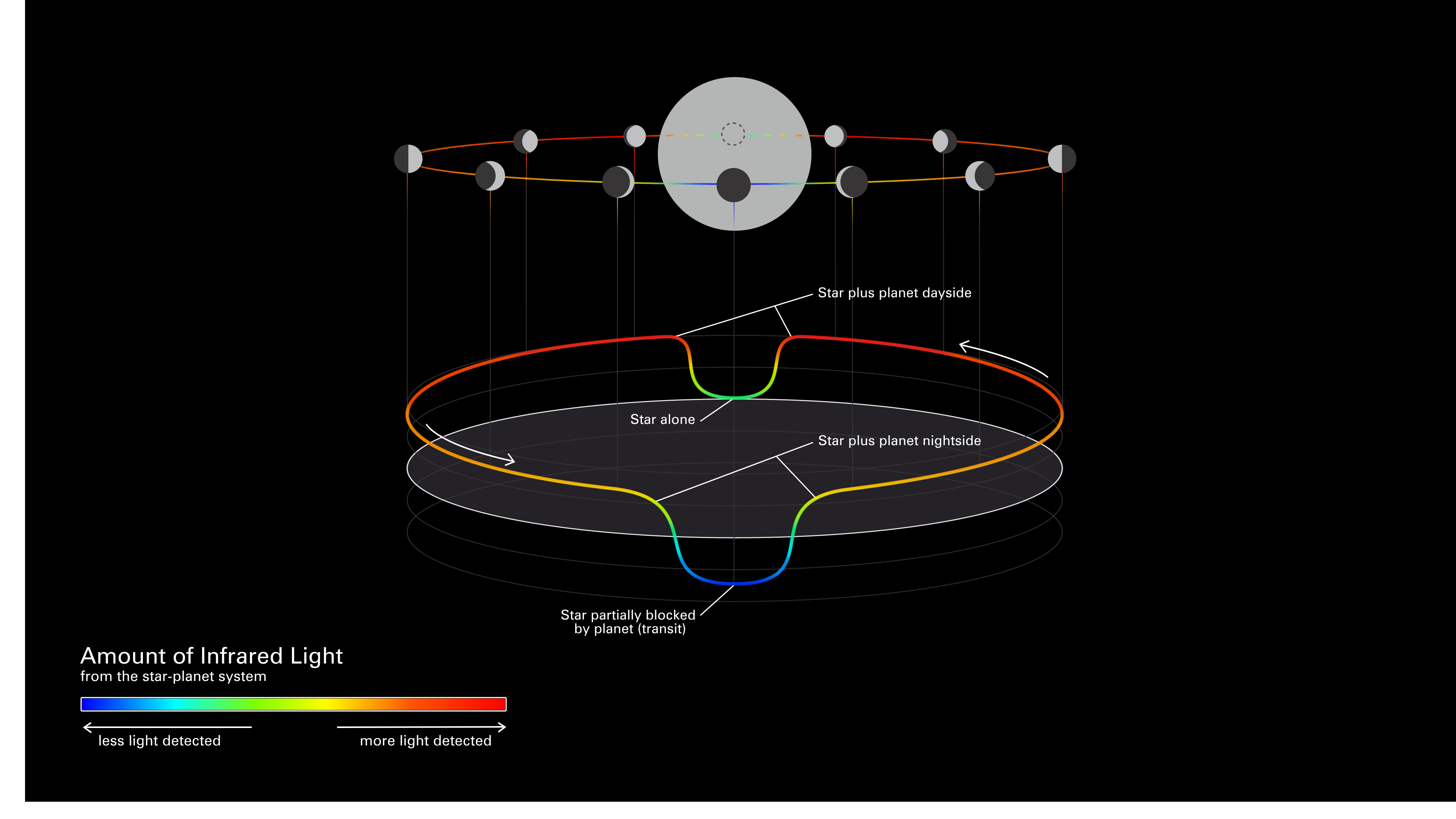
This simplified diagram of an exoplanet phase curve shows the change in total brightness of a star–planet system as the planet orbits the star. The system looks brighter when more of the lit side of the planet is facing the telescope (full phase), and dimmer when more of the dark side is facing the telescope (new phase).
(Top) Diagram showing the change in a planet’s phase (the amount of the lit side facing the telescope) as it orbits its star. (Middle) Three-dimensional graph showing the change in the total brightness of the star–planet system as the planet orbits its star. In this graph, known as a light curve, the horizontal plane is orbital location and the vertical axis is brightness. (Bottom) Color scale bar. In both the orbital diagram and the light curve, brightness is color-coded from blue (least amount of light detected) to red (most light detected).
Researchers will use Webb’s Mid-Infrared Instrument (MIRI) to measure the brightness of different wavelengths of mid-infrared light as exoplanet GJ 1214 b completes one full orbit around its star. Although Webb will not be able to observe the planet directly on its own – the star is too bright and the planet too close to see separately – it is sensitive enough to measure very subtle changes in the total amount of light from the star and planet together, as the planet moves.
Because it is so close to its star, GJ 1214 b is thought to be tidally locked: One side of the planet faces toward the star at all times and is permanently lit, while the other side faces away in permanent darkness. As a result, the day side of the planet is expected to be significantly hotter, emitting more infrared light than the night side. However, the detailed difference in temperature with longitude depends on how much the atmosphere reflects or absorbs starlight, how well it retains heat, and how it moves heat from one side of the planet to the other. This in turn depends on the composition of the atmosphere. (A water steam atmosphere, for example, would transport a very different amount of heat to the night side than an atmosphere dominated by hydrogen.) Researchers will use the mid-infrared phase curve of GJ 1214 b to map the temperature of the planet by longitude, and then use that information to narrow down possible atmospheric characteristics.
Extended Description and Image Alt Text
Extended Description
Graphic showing the change in total infrared brightness of a star-planet system as the planet orbits the star.
Overview
There are three parts of the graphic. At the top is a diagram showing 12 positions of the planet as it orbits the star, with the path of the planet shown as a colored line corresponding to the total brightness of system. The view of the orbit is nearly edge-on.
The middle shows the same change in brightness of the system as the planet orbits the star, but in the form of a line graph where the height and color of the line corresponds to brightness. Unlike a typical line graph, which shows position on the x-axis only, in this graph position is plotted on the x- and z-axes, which together form a horizontal plane to correspond with the planet’s orbital plane.
The line graph is aligned with the position diagram so that the relationship between the two is clear: Lines connect the planet positions with the related point on the graph.
Below the position diagram and line graph is a rainbow scale bar that explains the color coding of planet path and the line graph. Blue represents least light detected. Red represents most light detected.
Detailed Description
Color Scale Bar
The horizontal bar is titled “Amount of Infrared Light from the star-planet system.” The bar is rainbow colored, with colors transitioning from left to right: blue, green, yellow, orange, and red. The blue end of the scale at the left is labeled “less light detected” and the red end at the right is labeled “more light detected.”
Planet Position Diagram
The diagram shows 12 positions of the planet as it orbits the star, along with the amount of the lit side of the planet that is facing the telescope at each point. Small gray-filled circles represent the planet. One large, lighter gray circle at the center represents the star. The view of the planet’s orbit is edge-on and slightly oblique such that it is clear that the planet moves in front and behind the star from the perspective of the viewer. From this perspective, the orbital path is a very flattened ellipse. The orbital path is colored from blue to red to indicate the change in the amount of light detected from the system as the planet orbits.
Each circle is shaded to differentiate between the day side facing the star (light gray) and the night side facing away from the star (dark gray). When the planet is directly in front of the star, only the night side is visible and the circle is completely dark gray. When the planet is behind the star, it is shown with a dashed outline. Just before and after it passes behind the star, most of the circle is colored light gray to indicate that most of the dayside is visible. When the planet is on the far right and far left in the orbit, the half facing the star is light gray and the half facing away is dark gray.
The color of the orbital path shows that the total amount of light from the system is lowest (the line is blue) when the planet is blocking part of the star and only the night side is visible. The amount of light is greatest (the line is red) just before and after the planet moves behind the star, and both the starlight and light from the dayside of the planet are visible.
Brightness Graph
This graph also shows the change in the total brightness of the star–planet system as the planet orbits its star. The vertical axis is brightness, with total brightness increasing upward. Orbital location is plotted on a horizontal plane corresponding to the orbital plane in the planet position diagram. The color of the line corresponds to the brightness (value on the vertical axis), from blue for least amount of light detected to red for most light detected. The line includes arrows pointing counter-clockwise to correspond to the direction of orbit.
Graph Shape and Color
Beginning at the 9:00 position at the far left and moving counter-clockwise with the orbital path, the graph has a gentle downward slope toward the 6 o’clock position at the front center, gradually changing in color from reddish orange to yellowish green. In the front center, the graph forms a steep-sided valley with a flat floor. The floor of the valley is blue and is labeled, “star partially blocked by planet (transit).” The tops of the valley walls are yellow-green and are labeled, “star plus planet nightside.” The graph then slopes gently upward, gradually changing color from yellow-green at the 5 o’clock position, to reddish orange and then to red as it continues around to the 1 o’clock position at the back. At the 12 o’clock position in the back center, the graph forms another steep-sided valley with a flat floor. The floor of the valley is green and is not as deep as the blue valley in the front center. The floor of the back valley is labeled, “star alone.” The tops of the back valley walls are red and are labeled, “star plus planet dayside.” Continuing counter-clockwise from the top of the valley wall at the 11 o’clock position, the graph has a gentle slope downward, gradually changing color from red to reddish orange at the 9 o’clock position.
Relationship between the Position Diagram and Brightness Graph
The 12 planet positions are as follows, starting at the six o’clock position in the center front, and circling counter-clockwise around the star. The diagram and graph are symmetrical from left to right about an imaginary line that runs from the 12:00 to the 6 o’clock positions. (That is, the 7, 8, 9, 10, and 11 o’clock positions mirror the 5, 4, 3, 2, and 1:00 positions respectively.)
- 6 o’clock position: The planet is in front of the star. Only the night side is visible. The brightness is at its lowest point, indicated by dark blue color of the orbital path. This is the deep valley floor of the graph, which is labeled “Star partially blocked by planet (transit).”
- 5 o’clock position: A thin crescent—about one sixth—of the lit side is visible. The brightness is at about 50% of the maximum, indicated by greenish-yellow coloring on the graph and orbital path. This position corresponds to the top of the right wall of the deep front valley on the graph, which is labeled “Star plus planet nightside.”
- 4 o’clock position: About one-third of the lit side is visible. The brightness is at about 70%, indicated by orange coloring on the graph and orbital path. This position corresponds to the front portion of the gradual upward slope of increasing brightness on the graph.
- 3 o’clock position: Half of the planet is lit and half is in darkness. The brightness is at about 75%, indicated by orange-red coloring on the graph and orbital path. This position corresponds to the far right side of the gradual upward slope of increasing brightness on the graph.
- 2 o’clock position: About two-thirds of the lit side of the planet is visible. The brightness is at about 80%, indicated by the red coloring on the graph and orbital path. This position corresponds to the back portion of the gradual upward slope of increasing brightness on the graph.
- 1 o’clock position: Most of the lit side (about five-sixths) of the planet is visible. The brightness is at its greatest, indicated by the deep red coloring on the graph and orbital path. The position corresponds to the top of the right wall of the back valley, which is labeled “Star plus planet dayside.”
- 12 o’clock position: The planet is behind the star and is not visible. The brightness is at about 40%, indicated by the green coloring on the graph and orbital path. This position corresponds to the floor of the back valley, which is labeled “Star alone.”
- 11 o’clock position: This mirrors the 1 o’clock position. Most of the lit side (about five-sixths) of the planet is visible. The brightness is at its greatest, indicated by the deep red coloring on the graph and orbital path. The position corresponds to the top of the left wall of the back valley, which is labeled “Star plus planet dayside.”
- 10 o’clock position: This mirrors the 2 o’clock position. About two-thirds of the lit side of the planet is visible. The brightness is at about 80%, indicated by the red coloring on the graph and orbital path. This position corresponds to the back portion of the gradual downward slope of decreasing brightness on the graph.
- 9 o’clock position: This mirrors the 3 o’clock position. Half of the planet is lit and half is in darkness. The brightness is at about 75%, indicated by orange-red coloring on the graph and orbital path. This position corresponds to the far left side of the gradual downward slope of decreasing brightness on the graph.
- 8 o’clock position: This mirrors the 4 o’clock position. About one-third of the lit side is visible. The brightness is at about 70%, indicated by orange coloring on the graph and orbital path. This position corresponds to the front portion of the gradual downward slope of decreasing brightness on the graph.
- 7 o’clock position: This mirrors the 5 o’clock position. A thin crescent—about one sixth—of the lit side is visible. The brightness is at about 50%, indicated by greenish-yellow coloring on the graph and orbital path. This position corresponds to the top of the left wall of the deep front valley on the graph, which is labeled “Star plus planet nightside.”
Image Alt Text
Graphic showing the change in infrared brightness of a star-planet system as the planet orbits the star.
About the Object
- R.A. PositionR.A. PositionRight ascension – analogous to longitude – is one component of an object's position.17:15:19.54
- Dec. PositionDec. PositionDeclination – analogous to latitude – is one component of an object's position.+4:57:38.45
- ConstellationConstellationOne of 88 recognized regions of the celestial sphere in which the object appears.Ophiuchus
- DistanceDistanceThe physical distance from Earth to the astronomical object. Distances within our solar system are usually measured in Astronomical Units (AU). Distances between stars are usually measured in light-years. Interstellar distances can also be measured in parsecs.48 light-years
About the Data
- Data DescriptionData DescriptionProposal: A description of the observations, their scientific justification, and the links to the data available in the science archive.
Science Team: The astronomers who planned the observations and analyzed the data. "PI" refers to the Principal Investigator.
- Object NameObject NameA name or catalog number that astronomers use to identify an astronomical object.GJ 1214 b
- Object DescriptionObject DescriptionThe type of astronomical object.Warm sub-Neptune exoplanet
- Release DateNovember 17, 2021
- Science ReleaseNASA’s James Webb Space Telescope Primed to Lift the Haze Surrounding Sub-Neptunes
- CreditIllustration: NASA, ESA, CSA, Dani Player (STScI)
Related Images & Videos
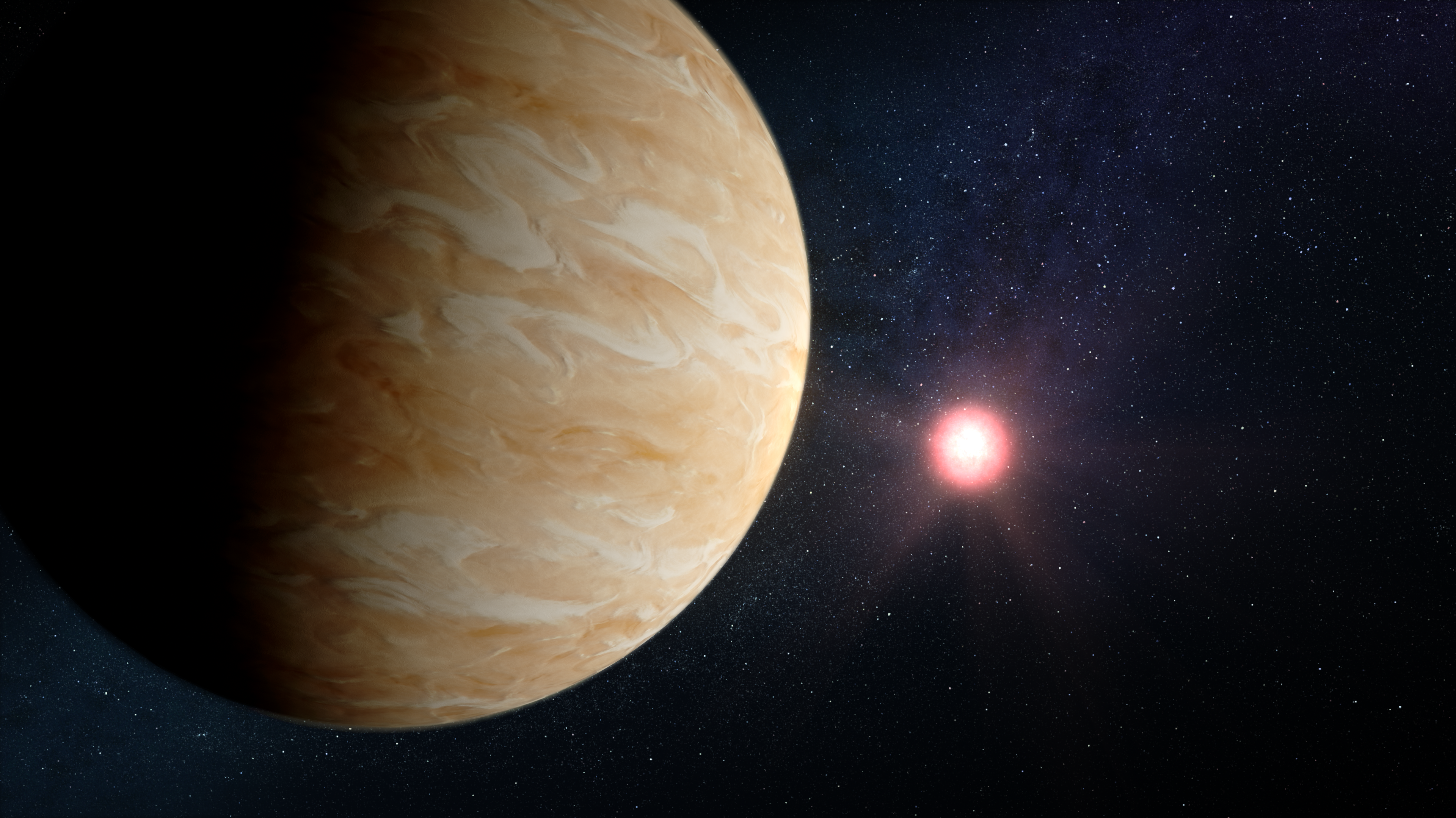
Exoplanet TOI-421 b and Its Star (Illustration)
Illustration of what exoplanet TOI-421 b might look like. TOI-421 b is a hot sub-Neptune-sized exoplanet orbiting a Sun-like star roughly 244 light-years from Earth. TOI-421 b is thought to have a clear atmosphere free of haze and clouds. This illustration is based on our...
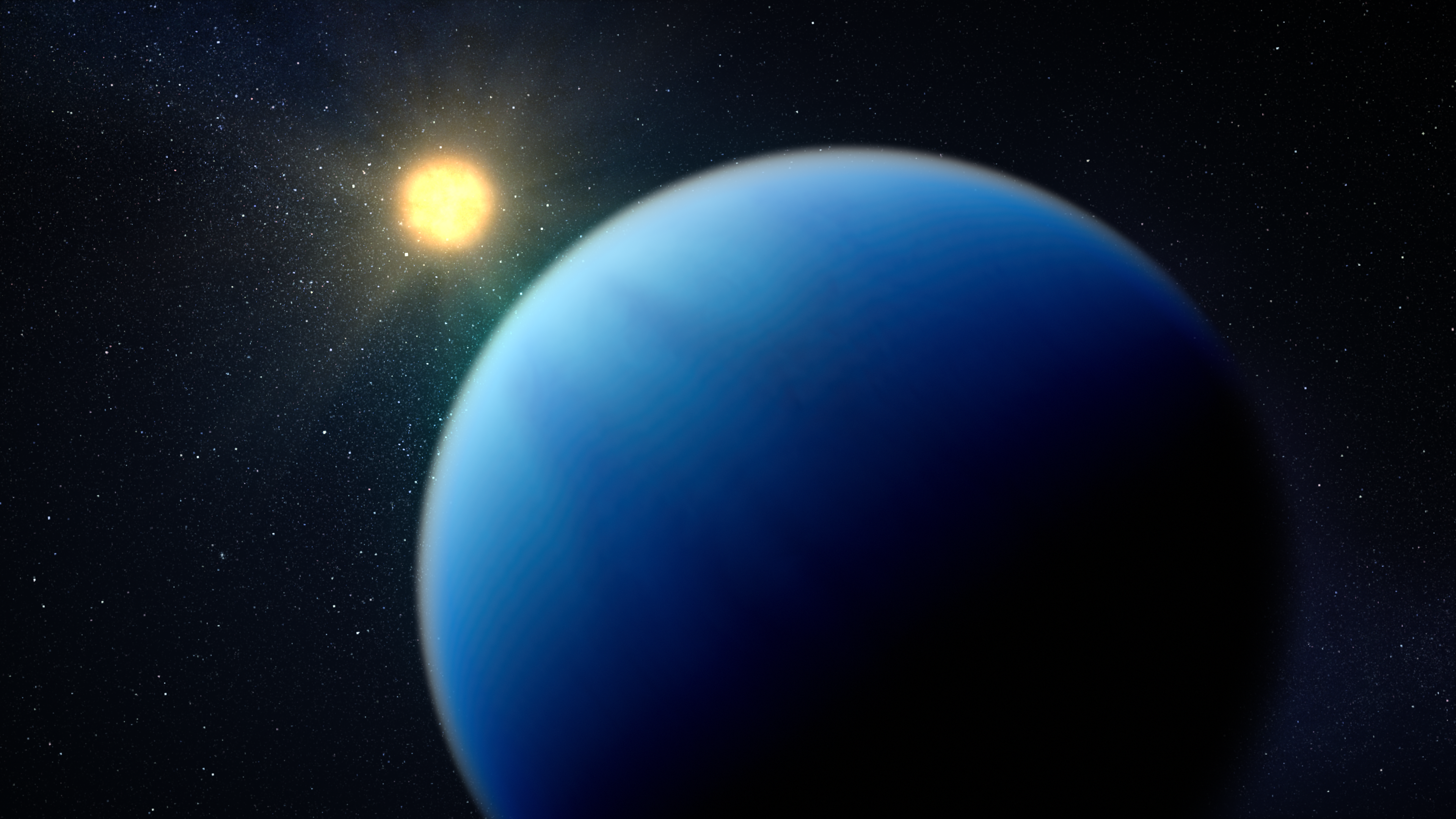
Exoplanet GJ 1214 b and Its Star (Illustration)
Illustration showing what exoplanet GJ 1214 b could look like based on current information. GJ 1214 b, a warm sub-Neptune-sized exoplanet roughly 48 light-years from Earth, is one of the most studied exoplanets in the galaxy. Previous spectroscopic observations indicate that the...
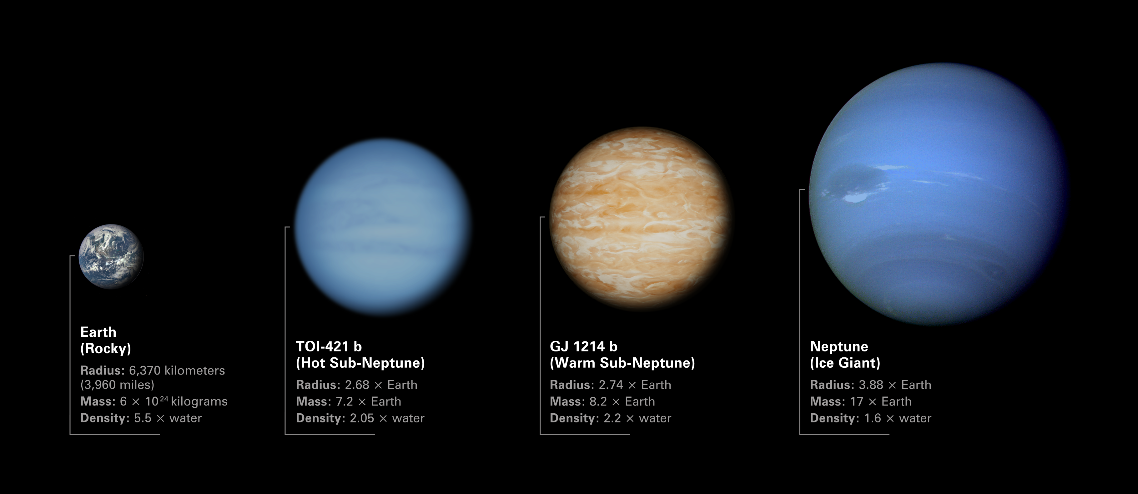
Comparison of TOI-421 b and GJ 1214 b to Earth and Neptune
Illustration comparing the sizes of sub-Neptune exoplanets TOI-421 b and GJ 1214 b to Earth and Neptune. Both TOI-421 b and GJ 1214 b are in between Earth and Neptune in terms of radius, mass, and density. The low densities of the two exoplanets indicates that they must have...
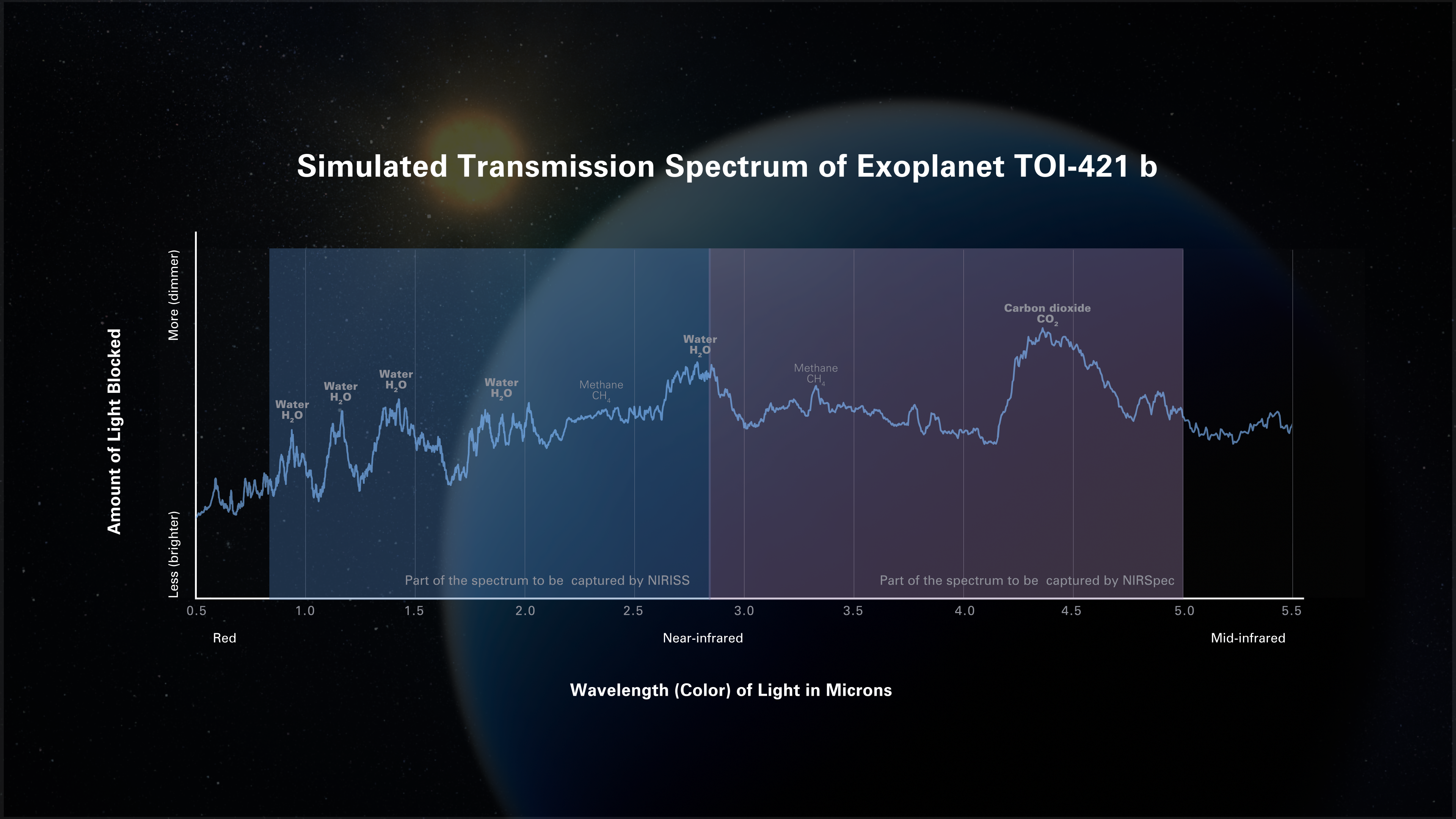
Simulated Transmission Spectrum of Exoplanet TOI-421 b
Possible transmission spectrum of the hot sub-Neptune exoplanet TOI-421 b. A transmission spectrum shows the amount of starlight of different wavelengths (colors) that is blocked by the planet’s atmosphere. Researchers use computer models to predict what spectra will look like...
Share
Details
Laura Betz
NASA’s Goddard Space Flight Center
Greenbelt, Maryland
laura.e.betz@nasa.gov
NASA, ESA, CSA, Dani Player (STScI)