


1 min read
Hot Gas Giant Exoplanet WASP-39 b Transit Light Curve (NIRSpec)
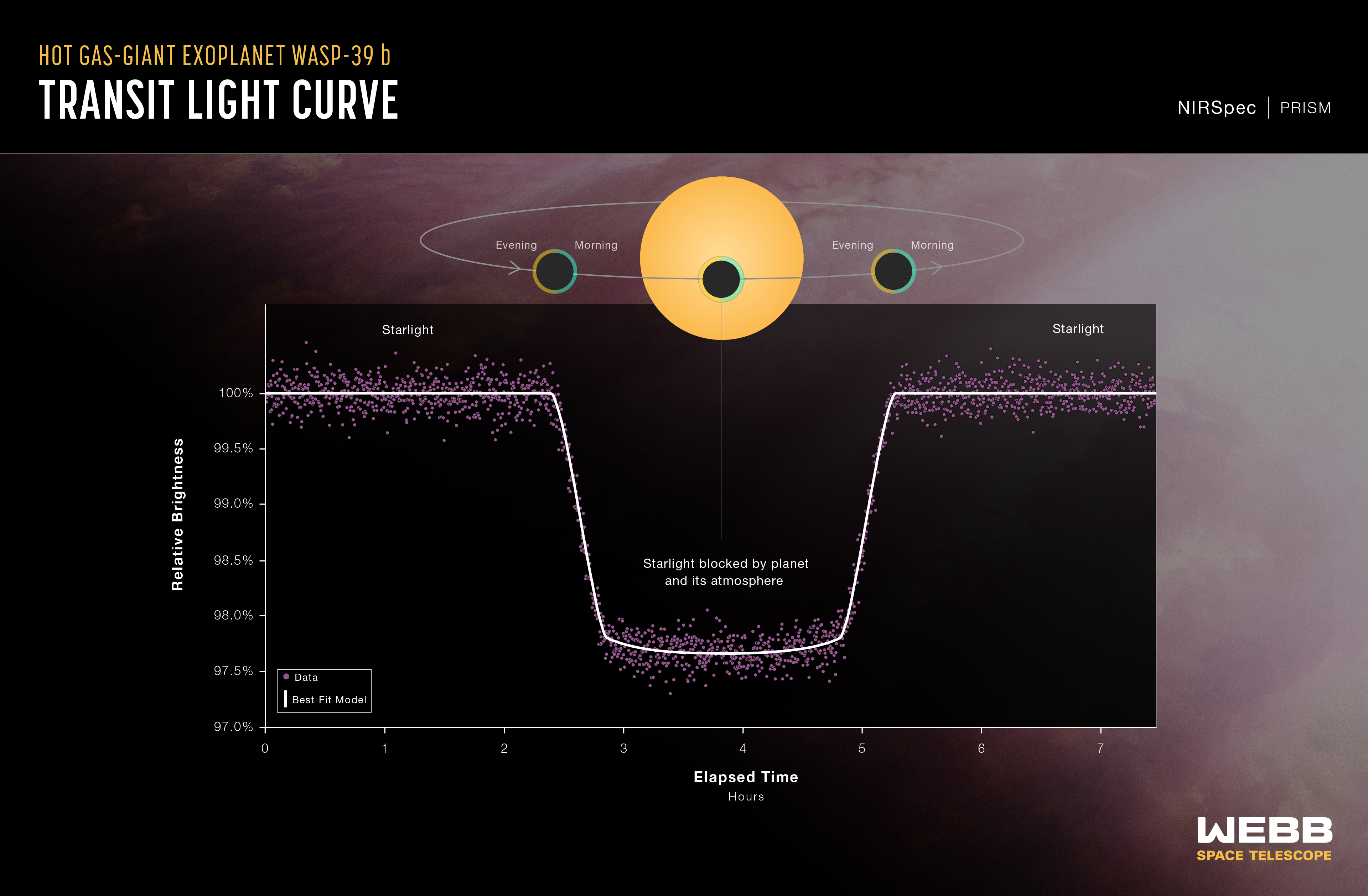
A light curve from NASA’s James Webb Space Telescope’s NIRSpec (Near-Infrared Spectrograph) shows the change in brightness from the WASP-39 star system over time as the planet transited the star. This observation was made using NIRSpec’s bright object time-series mode, which uses a grating to spread out light from a single bright object (like the host star of WASP-39 b) and measure the brightness of each wavelength of light at set intervals of time.
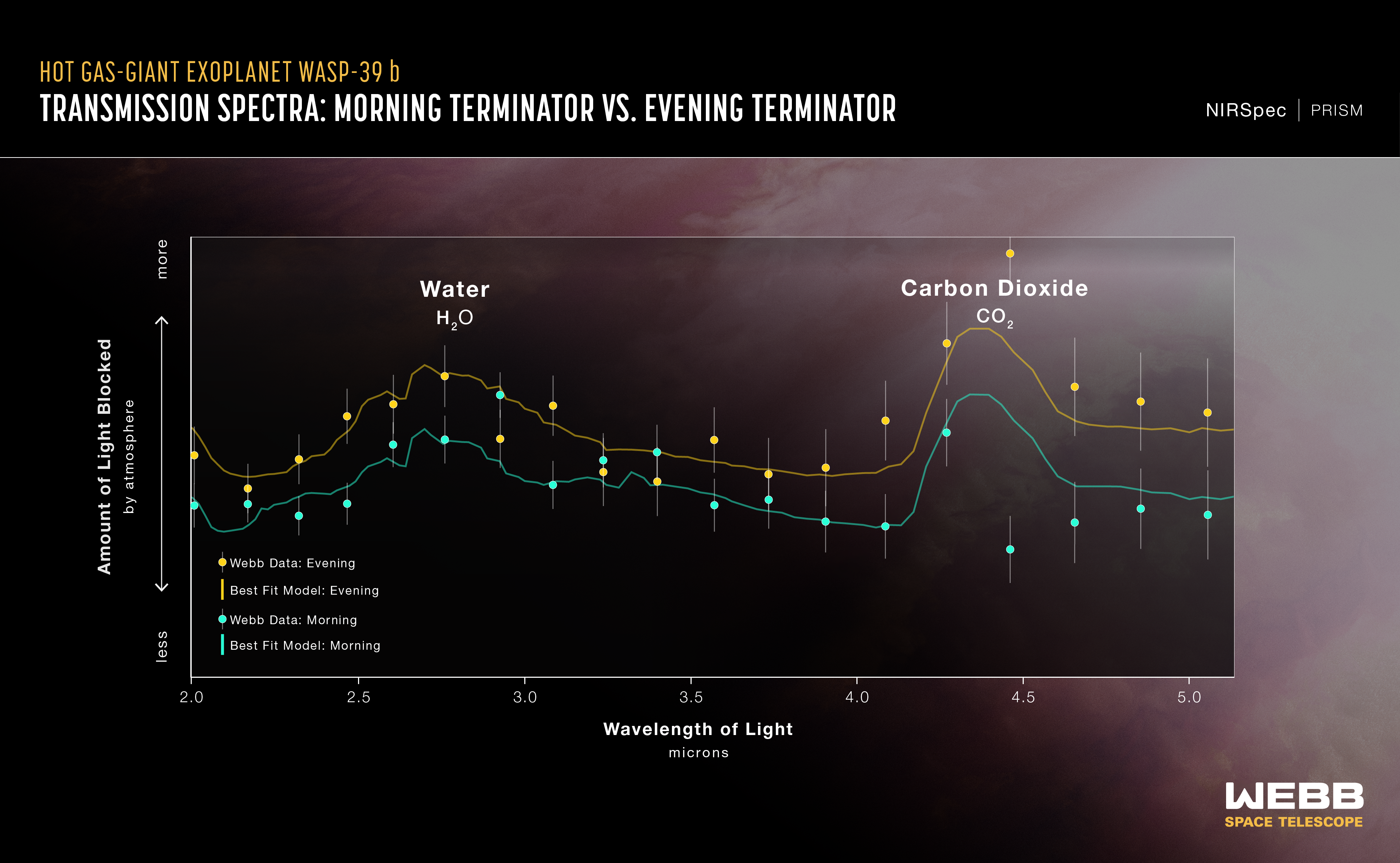
The background illustration of WASP-39 b and its star is based on current understanding of the planet from Webb spectroscopy and previous ground- and space-based observations. Webb has not captured a direct image of the planet or its atmosphere.
The artist’s concept displays the terminator of the exoplanet, the boundary that separates the planet’s dayside and nightside. The new analysis of a transmission spectrum of WASP-39 b from Webb’s NIRSpec builds two different spectra from the terminator region, essentially splitting the day/night boundary into two semicircles, one from the evening, and the other from the morning. Astronomers confirmed a temperature difference between the morning and evening, with the evening appearing hotter by roughly 300 Fahrenheit degrees (about 200 Celsius degrees). They also found evidence for different cloud cover, with the morning being likely cloudier than the evening.
Extended Description and Image Alt Text
Extended Description
Infographic titled “Infographic titled Hot Gas-Giant Exoplanet WASP-39 b Transit Light Curve, NIRSpec PRISM”
The graphic has two parts. At the top is a diagram showing a planet transiting (moving in front of) its star. Below the diagram is a graph showing the change in relative brightness of the star-planet system over time. The diagram and graph are aligned vertically to show the relationship between the geometry of the star-planet system as the planet orbits, and the measurements on the graph.
Diagram
At the center is a bright orange circle representing the star. A gray line looping around the star represents the orbital path of the plant. The line has two arrows pointing counter-clockwise to indicate the direction of motion of the planet. Three dark gray circles surrounded by light gray haloes represent the planet and its atmosphere at three different times during the orbit. From left to right: 1) At the beginning of the transit when the planet begins to move in front of the star; 2) in the middle of the transit when the planet is directly in front of the star; and 3) at the end of the transit as the planet ceases to block any part of the star.
Graph
Below the transit diagram is a graph of Relative Brightness in percent on the vertical y-axis versus Elapsed Time in hours on the horizontal x-axis.
Axes
The y-axis ranges from 97 percent relative brightness at the origin at the bottom to 100 percent at the top, with labeled tick marks every .5 percent. The x-axis ranges from 0 to 7 hours. There are labeled tick marks every hour.
Data
The graph consists of hundreds of data points that together form a U-shaped valley with flat plains on either side. The curve is almost perfectly symmetrical about the lowest point of the valley. The points are not connected, but are dense enough that they almost appear to be connected.
The first data point is at 0 hours. and the last is at 7.5 hours. Hundreds of blue data points form a thick, clear pattern with very little scatter. Some data points are overlapping.
Between the beginning of the curve at 0 hours. and the beginning of the transit at about 2 and a half hours, the relative brightness of the star-planet system remains flat around 100%.
Around 2 and a half hours., the brightness begins to decrease at a steady rate. Around 3 hours elapsed time, it levels off at a relative brightness of about 97.5 percent. The curve continues with a slightly concave-up shape until 5 hours have elapsed. when it begins to rise, showing a steady increase in brightness. The rise continues until the end of the transit at about 5 and half hours elapsed when the brightness levels off again at 100 percent. The curve then remains almost flat, with almost no variability, until the last data point until 7 and a half hours have elapsed.
There are two labels on the curve. The flat segment of 100 percent relative brightness to the left of the U-shaped valley is labeled “Starlight.” The U-shaped portion of the curve with brightness less than 100 percent is labeled “Starlight blocked by planet and its atmosphere.”
Relationship between the Diagram and Graph
A vertical gray line connects each of the three planet positions in the diagram to the corresponding points on the light curve. From left to right: 1) A small portion of the right side of the planet blocks the star and the relative brightness begins to decrease; 2) the entire planet is in front of the star and the relative brightness is at its lowest point (the center of the U-shaped valley); 3) a small portion of the left side of the planet is blocking the star and the relative brightness is almost back up to 100 percent.
Background
In the background of the graphic is an illustration of the planet’s terminator zone.
Image Alt Text
Infographic titled “Hot Gas-Giant Exoplanet WASP-39 b Transit Light Curve, NIRSpec PRISM.” At the top of the infographic is a diagram showing a planet transiting (moving in front of) its star. Below the diagram is a graph showing the change in relative brightness of the star-planet system over 7 hours. The diagram and graph are aligned vertically to show the relationship between the geometry of the star-planet system as the planet orbits, and the measurements on the graph. The infographic shows that the brightness of the system remains steady until the planet begins to transit the star. It then decreases until the planet is directly in front of the star. The brightness increases again until the planet is no longer blocking the star, at which point it levels out. Please reference the extended text description for more details.
- Release DateJuly 15, 2024
- Science ReleaseNASA’s Webb Investigates Eternal Sunrises, Sunsets on Distant World
- CreditIllustration: NASA, ESA, CSA, Ralf Crawford (STScI)
Related Images & Videos

Hot Gas Giant Exoplanet WASP-39 b (Artist's Concept)
This artist’s concept shows what the exoplanet WASP-39 b could look like based on indirect transit observations from NASA’s James Webb Space Telescope as well as other space- and ground-based telescopes. WASP-39 b is a hot, puffy gas giant that orbits a G-type star that is...
Hot Gas Giant Exoplanet WASP-39 b Transmission Spectrum (NIRSpec)
This transmission spectrum, captured using Webb’s NIRSpec (Near-Infrared Spectrograph) PRISM bright object-time series mode, shows the amounts of near-infrared starlight blocked by the atmosphere of hot gas giant exoplanet WASP-39 b. The spectrum shows clear evidence for water...
Share
Details
Laura Betz
NASA’s Goddard Space Flight Center
Greenbelt, Maryland
laura.e.betz@nasa.gov
NASA, ESA, CSA, Ralf Crawford (STScI)