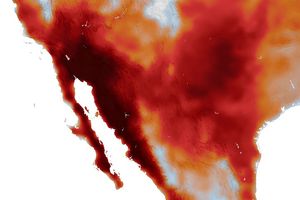


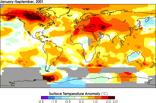
The figure above depicts how much air temperatures near the Earth’ssurface changed relative to the global mean temperature from 1951 to1980. NASA researchers used maps of urban areas derived from city lights datato account for the “heat island” effect of cities.
The red and orange colors show that temperatures are warmer in most regions of theworld when compared to the 1951 to 1980 “normal” temperatures.
Warming around the world has been widespread, but it is not presenteverywhere. The largest warming is in Northern Canada, Alaska andSiberia, as indicated by the deeper red colors. The lower 48 UnitedStates have become warmer recently, but only enough to make thetemperatures comparable to what they were in the 1930s.
The scale on the bottom of these temperature anomaly images representdegrees in Celsius. The negative numbers represent cooling and thepositive numbers depict warming.
Overall, the air temperature near the Earth’s surface has warmed by1°F (0.6°C) globally, on average, over the last century.
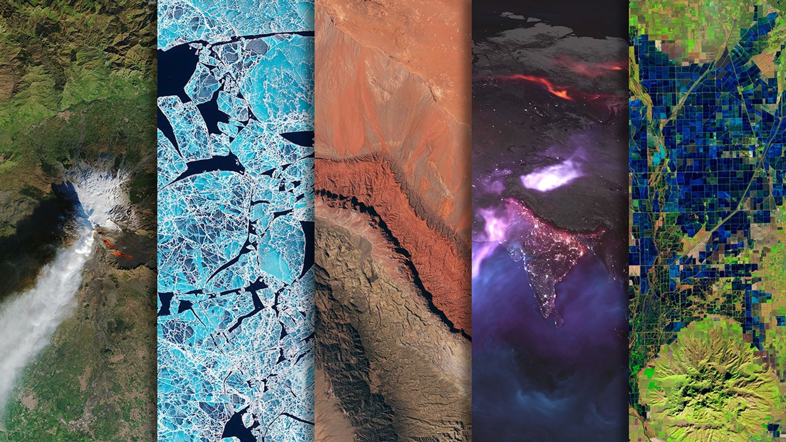
For more information and additional images, read Satellites Shed Light on a Warmer World.
References & Resources
Image courtesy Goddard Institute for Space Studies (GISS).