


1 min read
TRAPPIST-1 c Light Curve
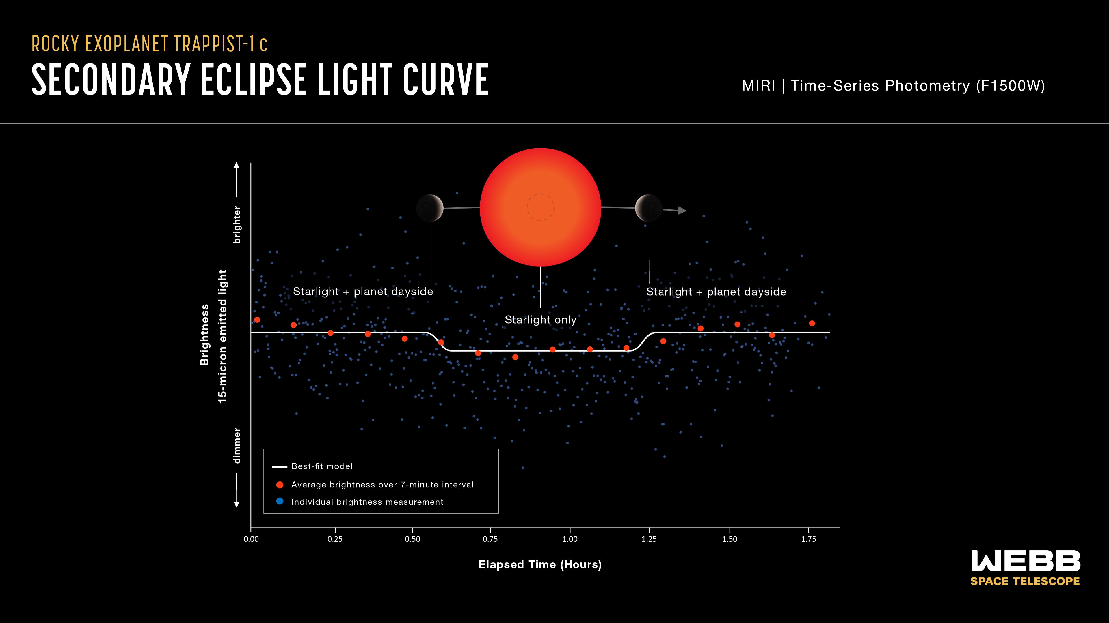
This light curve shows the change in brightness of the TRAPPIST-1 system as the second planet, TRAPPIST-1 c, moves behind the star. This phenomenon is known as a secondary eclipse.
Astronomers used Webb’s Mid-Infrared Instrument (MIRI) to measure the brightness of mid-infrared light. When the planet is beside the star, the light emitted by both the star and the dayside of the planet reach the telescope, and the system appears brighter. When the planet is behind the star, the light emitted by the planet is blocked and only the starlight reaches the telescope, causing the apparent brightness to decrease.
Astronomers can subtract the brightness of the star from the combined brightness of the star and planet to calculate how much infrared light is coming from the planet’s dayside. This is then used to calculate the dayside temperature and infer the presence and possible composition of the atmosphere.
The graph shows combined data from four separate observations made using MIRI’s F1500W filter, which only allows light with wavelengths ranging from about 13.5 - 16.7 microns to pass through to the detectors. The blue squares are individual brightness measurements. The red circles show measurements that are “binned,” or averaged to make it easier to see the change over time. The white line is the best fit, or model light curve that matches the data most closely. The decrease in brightness during the secondary eclipse is less than 0.05%.
The temperature calculated from this observation is 380 +/- 31 kelvins (between 170 and 280 degrees Fahrenheit). TRAPPIST-1 c is the coolest rocky exoplanet ever observed using secondary eclipse photometry.
Extended Description and Image Alt Text
Extended Description
Infographic titled “Rocky Exoplanet TRAPPIST-1 c Secondary Eclipse Light Curve, MIRI Time-Series Photometry (F1500W).”
The graphic has two parts. At the top is a diagram showing a planet moving behind its star (a secondary eclipse). Below the diagram is a graph showing the change in relative brightness of the star-planet system over time. The diagram and graph are aligned vertically to show the relationship between the geometry of the star-planet system as the planet orbits, and the measurements on the graph.
Diagram of Secondary Eclipse
At the center is a bright red-orange circle representing the star. A slightly arcuate gray line with an arrow pointing to the right represents a portion of the orbital path of the planet. Along the gray line, and on either side of the star, is a gray circle with a textured pattern. These represent the planet before (at left) and after (right) it moves behind the star. Both show a subtle brightening on the star-side of the planet. Along the line, in the middle of the star is an open circle with a dashed outline representing the position of the planet in the middle of the secondary eclipse, when it is behind the star. The star and planet are not to scale.
Graph
Below the secondary eclipse diagram is a graph of Brightness of 15-micron emitted light on the vertical y-axis versus Elapsed Time in hours on the horizontal x-axis.
Axes
The y-axis ranges from dimmer at the bottom to brighter at the top. There are no units or tick marks. The x-axis ranges from 0.00 hours at the origin on the left to 1.75 hours at the far right. There are labeled tick marks every 0.25 hours.
Key
The graph includes a key showing that the large red circles are brightness measurements averaged over 7-minute intervals; the solid blue squares are individual brightness measurements; and the white line represents a best-fit model.
Data and Model
The graph consists of 636 individual brightness measurements plotted as small solid blue squares, and 16 binned brightness measurements (averaged over 7-minute intervals) plotted as larger solid red circles. The points are not connected.
The individual brightness measurements (blue squares) show a broad scattering across the graph. No trend is visible by eye.
The binned brightness measurements (red circles) show a a slight decrease in brightness between 0 and about 0.75 hours, and a slight increase with some variability between 0.75 and 1.75 hours.
A best-fit model is shown as a thin white line running left to right across the graph. The line forms a shallow U-shaped valley in the center, with flat plains on either side. The valley has steep sides and a flat floor. It begins at about 0.55 hours and ends at 1.25 hours. The line intersects some, but not all, of the red binned brightness measurements
Labels
There are three labels above the model and binned brightness measurements. The label in the center, above the dimmer, U-shaped section of the model and data points, is labeled “Starlight only.” The brighter sets of measurements on the left and right sides of the graph are both labeled, “Starlight + planet dayside.”
Relationship between the Diagram and Graph
Vertical gray lines connect each of the three planet positions in the diagram to the corresponding portions of the light curve. From left to right: 1) Before the planet begins to move behind the star, the brightness is high and fairly level; 2) When the entire planet is behind the star and the brightness is at its lowest point (the center of the U-shaped valley); 3) When the planet has moved out from behind the star, the brightness has increased back to the level it was before the decrease.
Image Alt Text
Graphic titled “Rocky Exoplanet TRAPPIST-1 c Secondary Eclipse Light Curve” showing a diagram of a secondary eclipse and a graph of change in brightness over time.
- Release DateJune 19, 2023
- Science ReleaseWebb Rules Out Thick Carbon Dioxide Atmosphere for Rocky Exoplanet
- CreditIllustration: NASA, ESA, CSA, Joseph Olmsted (STScI); Science: Sebastian Zieba (MPIA), Laura Kreidberg (MPIA)
Related Images & Videos
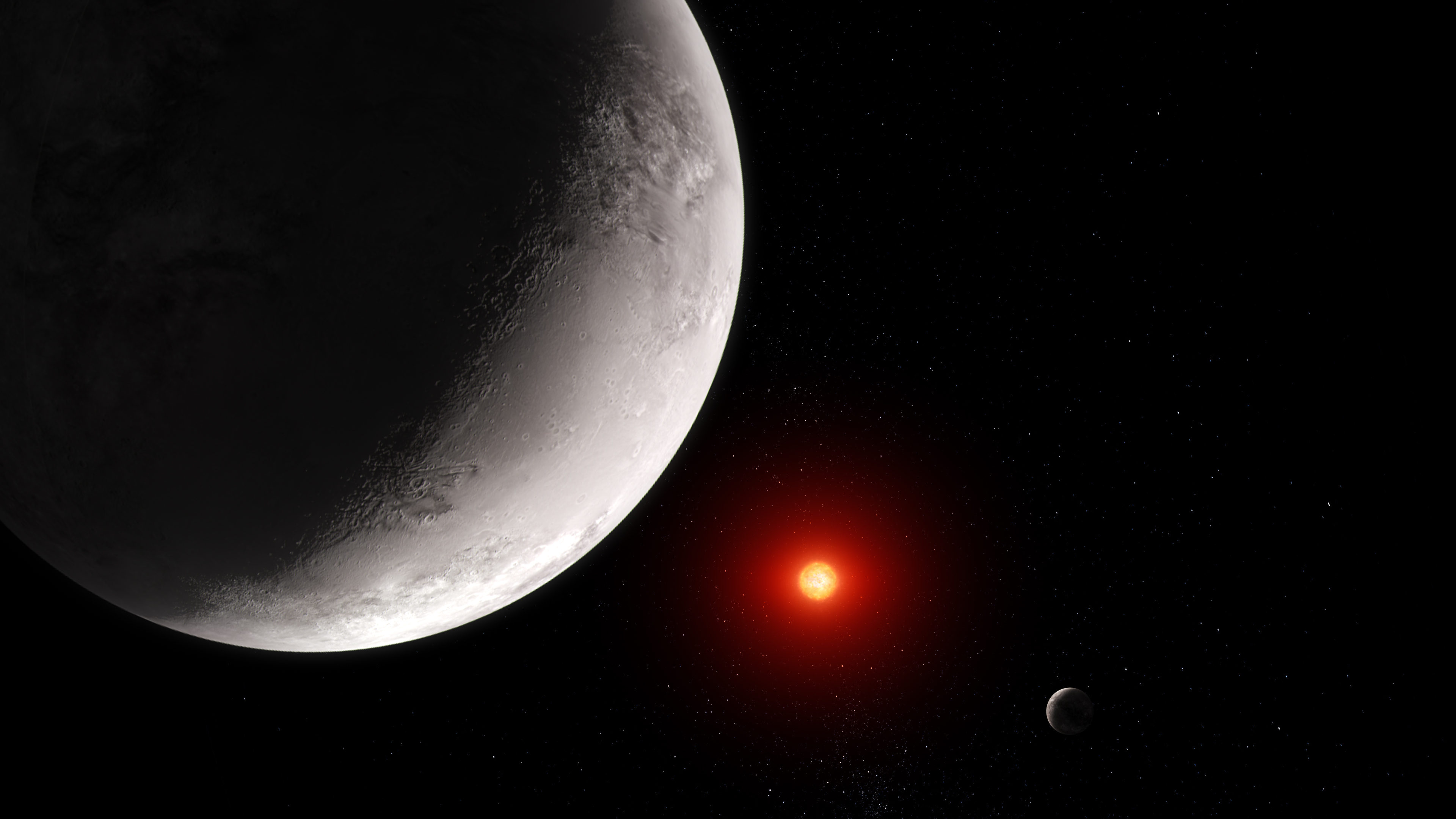
Rocky Exoplanet TRAPPIST-1 c (Artist Concept)
This artist' concept shows what the hot rocky exoplanet TRAPPIST-1 c could look like based on this work. TRAPPIST-1 c, the second of seven known planets in the TRAPPIST-1 system, orbits its star at a distance of 0.016 AU (about 1.5 million miles), completing one circuit in just...
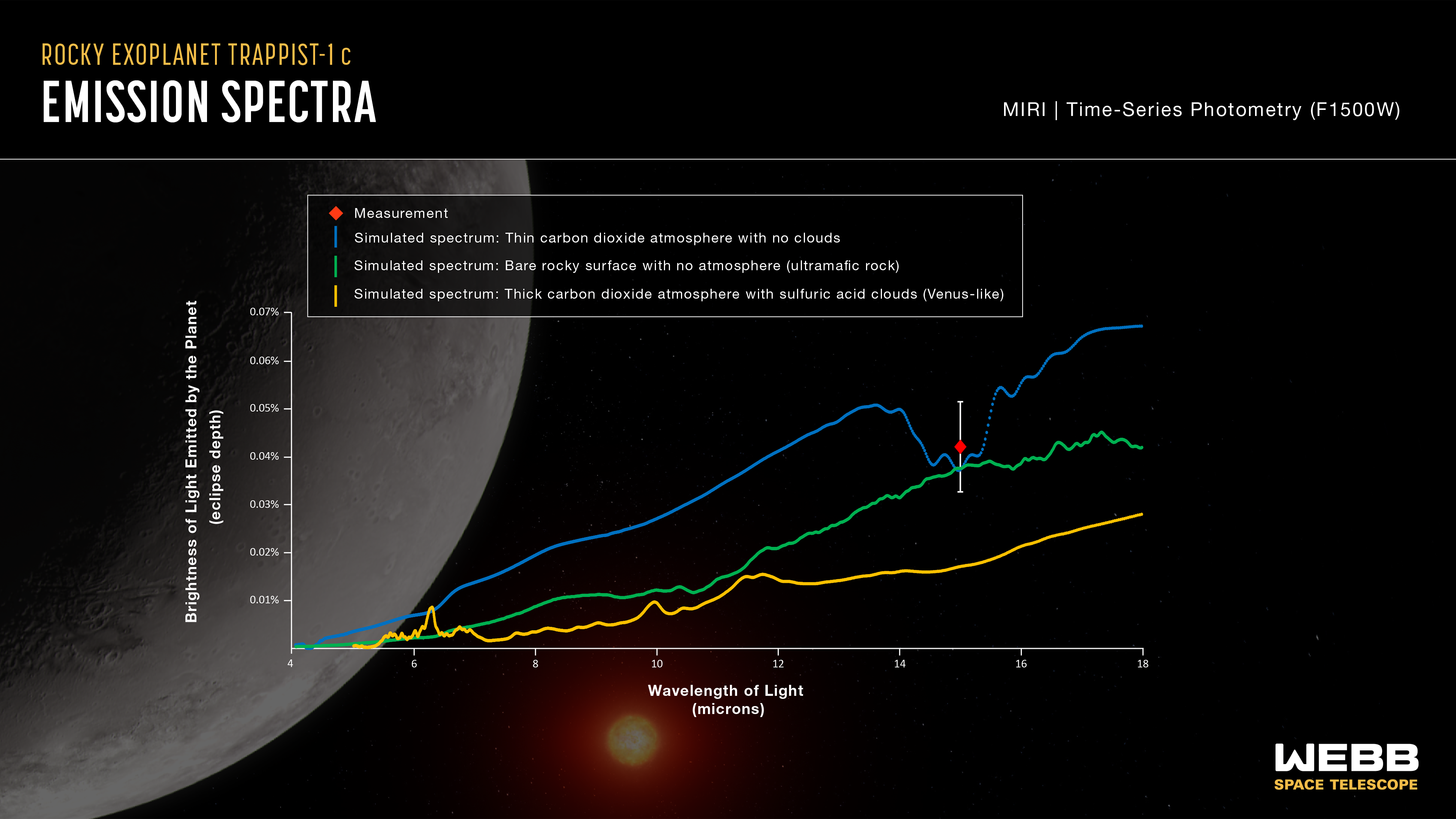
TRAPPIST-1 c Emission Spectra
This graph compares the measured brightness of TRAPPIST-1 c to simulated brightness data for three different scenarios. The measurement (red diamond) is consistent with a bare rocky surface with no atmosphere (green line) or a very thin carbon dioxide atmosphere with no clouds...
Share
Details
Laura Betz
NASA’s Goddard Space Flight Center
Greenbelt, Maryland
laura.e.betz@nasa.gov
NASA, ESA, CSA, Joseph Olmsted (STScI)
Sebastian Zieba (MPIA), Laura Kreidberg (MPIA)