


![Request for Information – Potential [Placeholder for Prize]](https://assets.science.nasa.gov/dynamicimage/assets/science/missions/a-step/FFR_Earth_Background_20251120%20.png?w=1024)


Plots of grades vs. who gets selected
They say that you're in the selectable category, but ever wondered what, really, are your chances of being selected? Historically, the Science Mission Directorate has not reported on selection rates as a function of peer reviewed scores. We are very pleased to share this data with you!
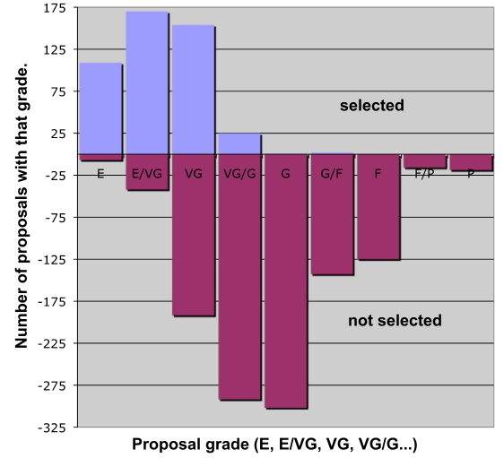
The first plot, below, shows the distribution of grades (along the x axis) vs. how many were selected, or not. The upward blueish bars (and positive values on the y axis) represent selected proposals, and the downward redish bars (and the negative numbers on the y axis) represent the proposals that were not selected.
A more recent example of this kind of data set for the planetary science division was presented by Jonathan Rall to the Planetary Science Subcommittee in Fall 2017. Please see page 33 of this presentation at:
The second plot, below, shows the same data but recast as percentages, so that each vertical bar now shows the percentage chance, overall, that a proposal with the grade along the x axis will be selected. For example, a proposal with a grade of 'excellent' was (at least partially) funded 94% of the time, with an 'excellent/very good' 80%, 'very good' 45%, and so on.
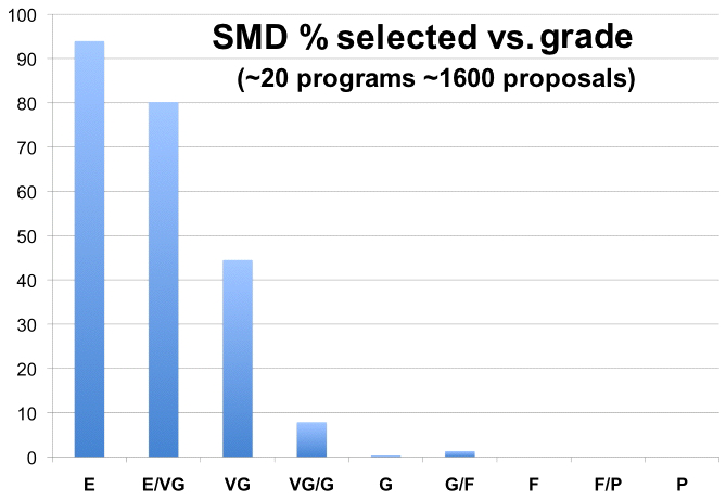
The data from which these plots were derived were based on a sample of 1,597 proposals (20 ROSES program elements) reviewed in 2007 and 2008 for which data was readily available. They are believed to be representative of the approximately 4000 proposals reviewed in that time frame. There are considerable sources of error including the fact that the data across divisions, reviews and in some cases even panels were not normalized in any way. When only one task within a proposal was funded, some program officers reported the overall (lower) grade for the proposal, whereas others reported the (higher) grade for just the funded task. The author makes no apologies, he is just happy to be able to share what data he has.
Please direct questions or corrections on this page to SARA@nasa.gov