


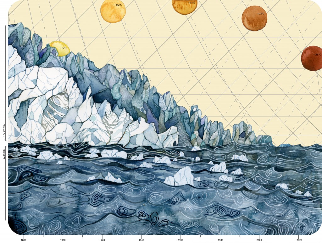
“Climate Change Data:” This piece uses multiple quantities: the annual decrease in global glacier mass balance, global sea level rise, and global temperature increase to convey how all of this data must be compared and linked together to figure out the fluctuations in Earth’s natural history. Art and caption by Jill Pelto
By Laura E.P. Rocchio
Glaciologist and prolific AGU blogger, Mauri Pelto, regularly publishes posts about changing glaciers around the globe on his From a Glacier’s Perspective blog.
In many cases, Landsat data informs his posts.
This month, Pelto posted five Landsat-based blog posts:
- West Hongu Glacier Retreat-Ablation Extending into January, Nepal; September 6, 2016
- Herbert Glacier Retreat, Alaska 1984-2016; September 14, 2016
- South Sawyer Glacier Retreat and Separation, Alaska; September 20, 2016
- Porcupine Glacier, BC 1.2km2 Calving Event Marks Rapid Retreat; September 22, 2016
- Storglombreen Glacier Loss, Norway; September 28, 2016
In an interesting aside, Pelto’s daugher, Jill Pelto, an artist and environmental scientist, has been combining her art and science backgrounds to create data-based works of art, like the artwork to the right.
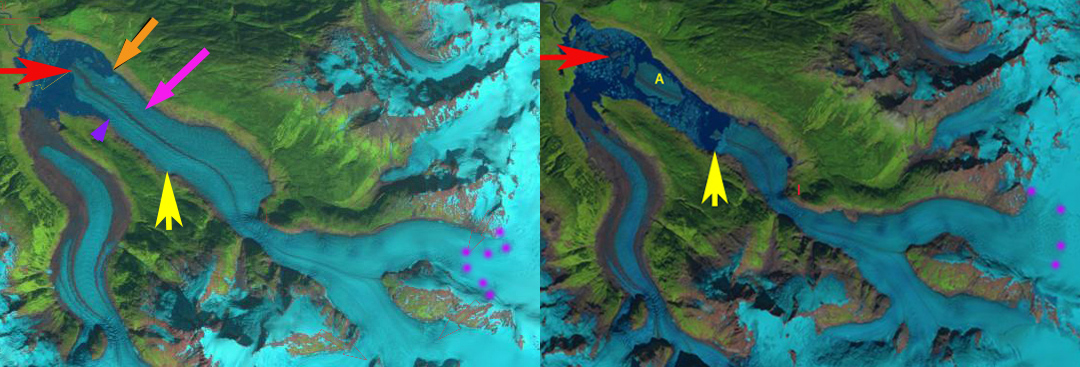
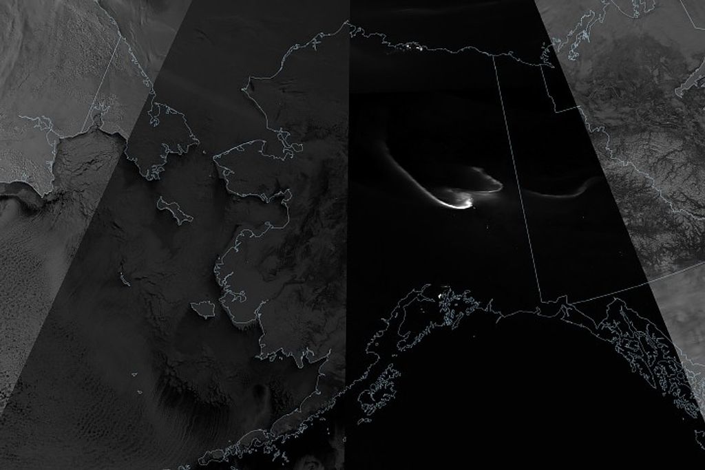
Landsat images from 1988 and 2016 comparing terminus locations of British Columbia’s Porcupine Glacier and its and snowline. Red arrow is the 1985 terminus and the yellow arrow the 2016 terminus. I marks an icefall location and point A marks the large iceberg. Purple dots indicate the snowline. Image credit: Mauri Pelto
Further Reading
+ From a Glacier’s Perspective
+ These Paintings Turn Climate Data Into Art, Climate Central
+ These Watercolor Paintings Actually Include Climate Change Data, Smithsonian
+ Painter captures the data of climate change in 7 stunning watercolors, PBS NewsHour


